Research on the Visual Language of NOT
To explore "nothing", we are collaborating with artists across different genres and disciplines.
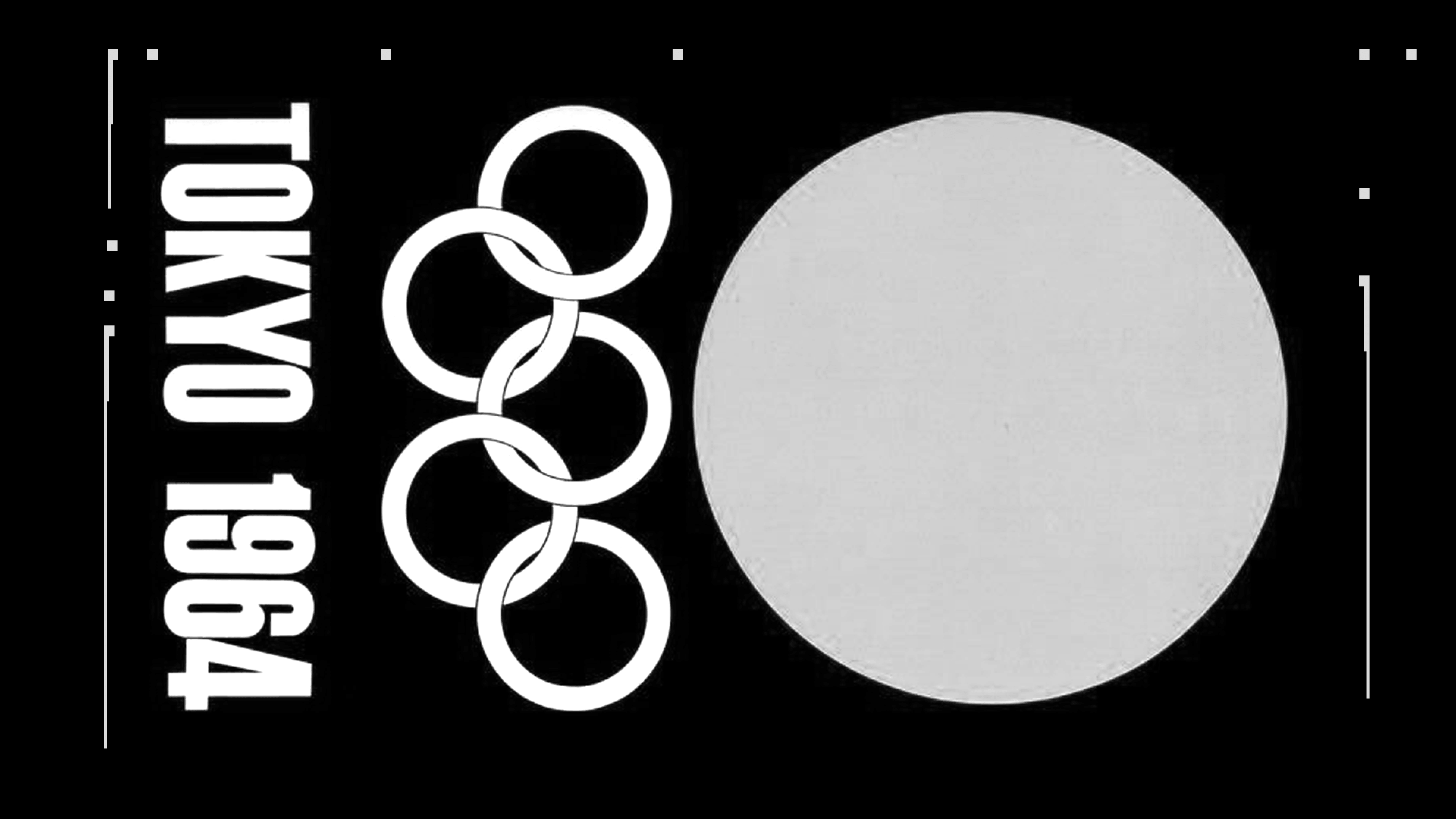
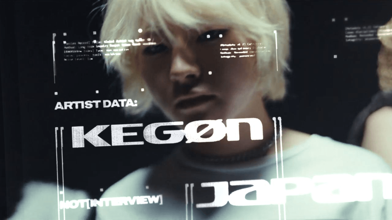
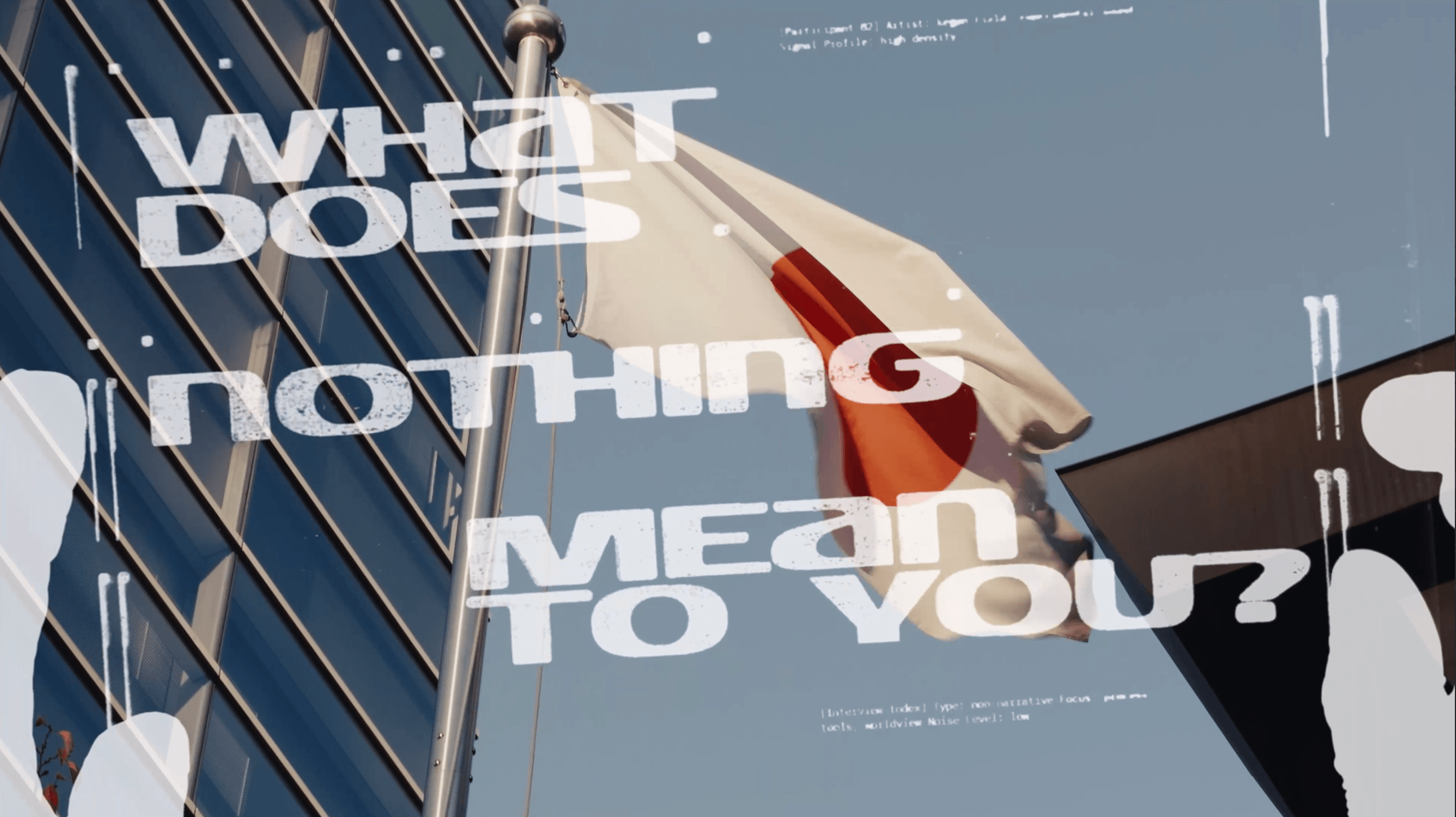
Timur Zima was one of the first. We asked him one question: what does "nothing" mean visually?
The goal was not to make a design or define a visual identity. More to see how the idea could be represented across mediums.
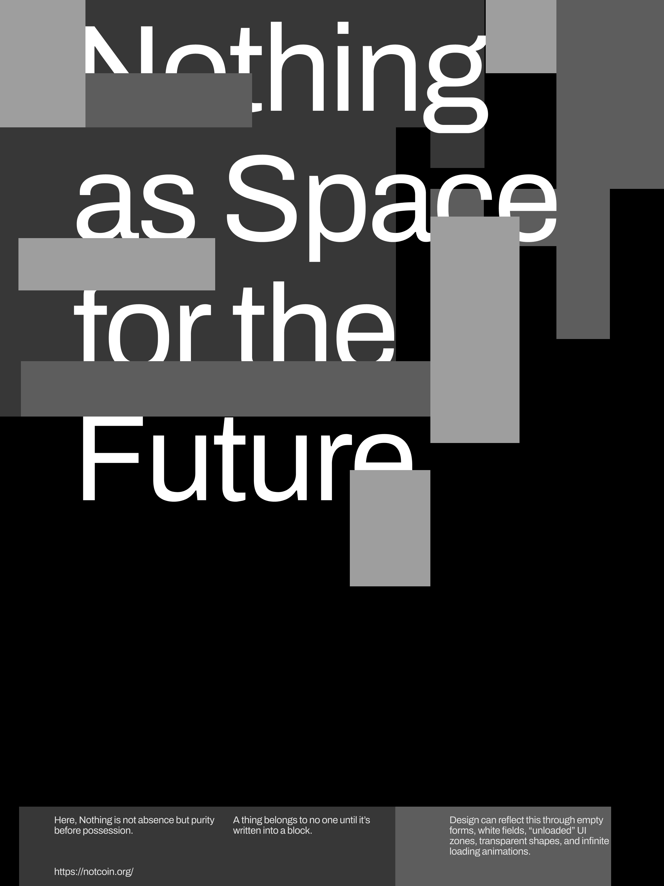
Understanding the idea of “nothing”
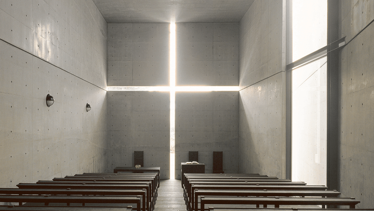
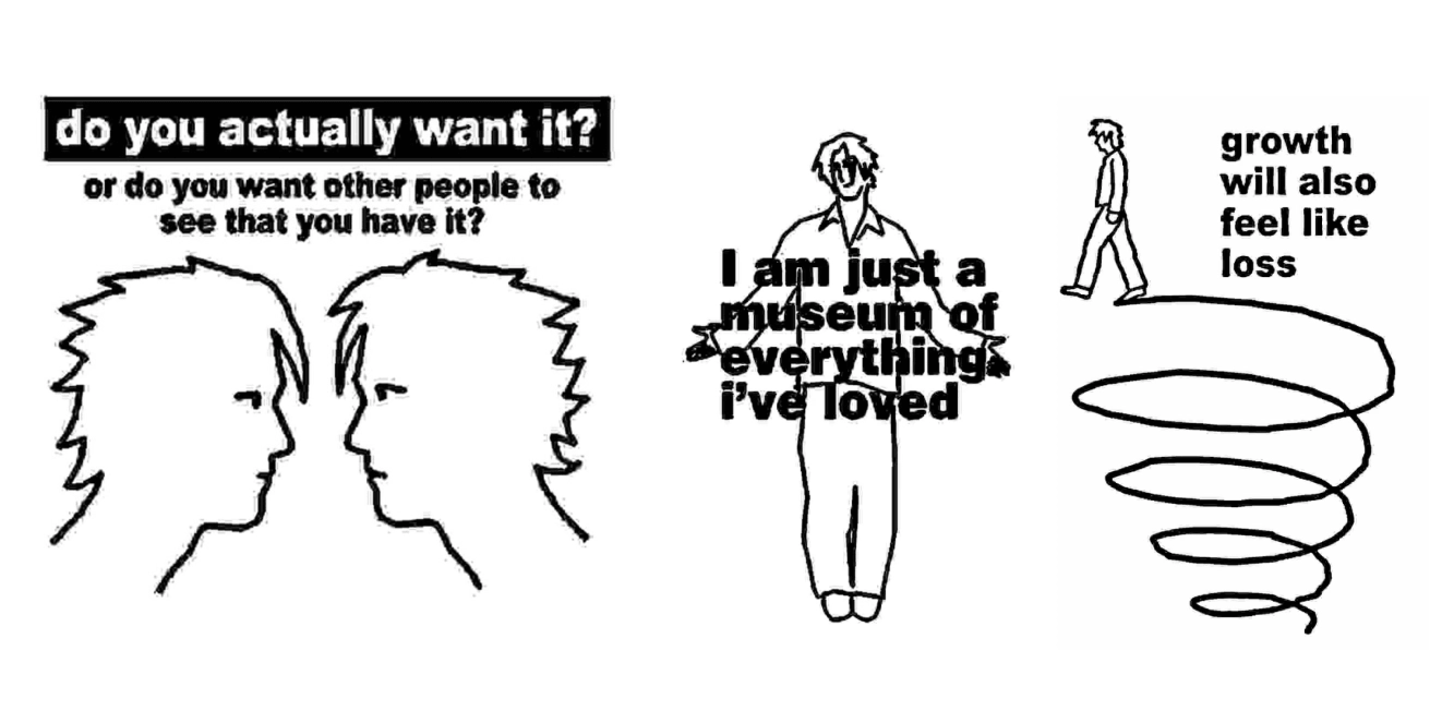
When you visualise something, you think about how it looks from different angles. But what does nothing look like? Can absence have a form? Can you build identity around something intentionally undefined?
We started there.
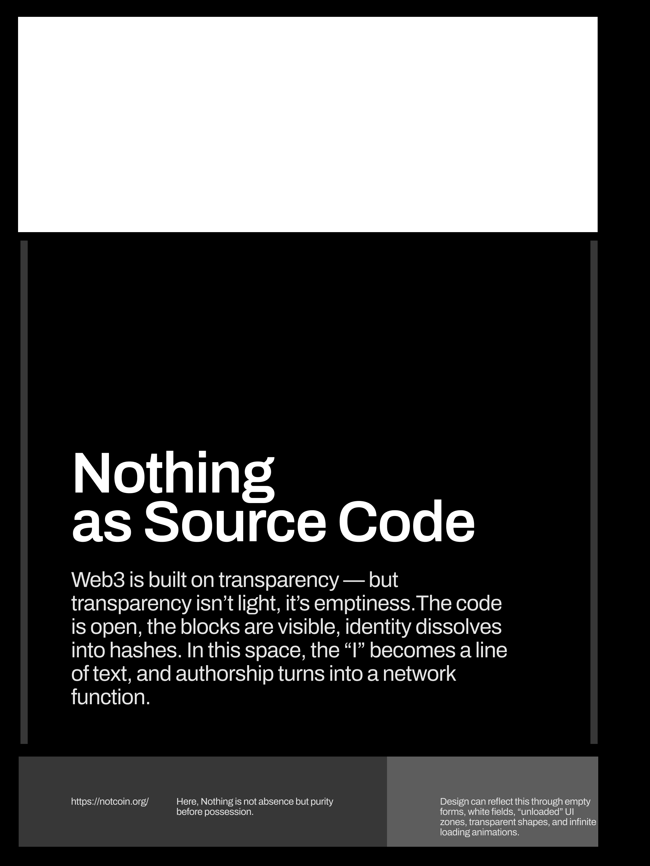
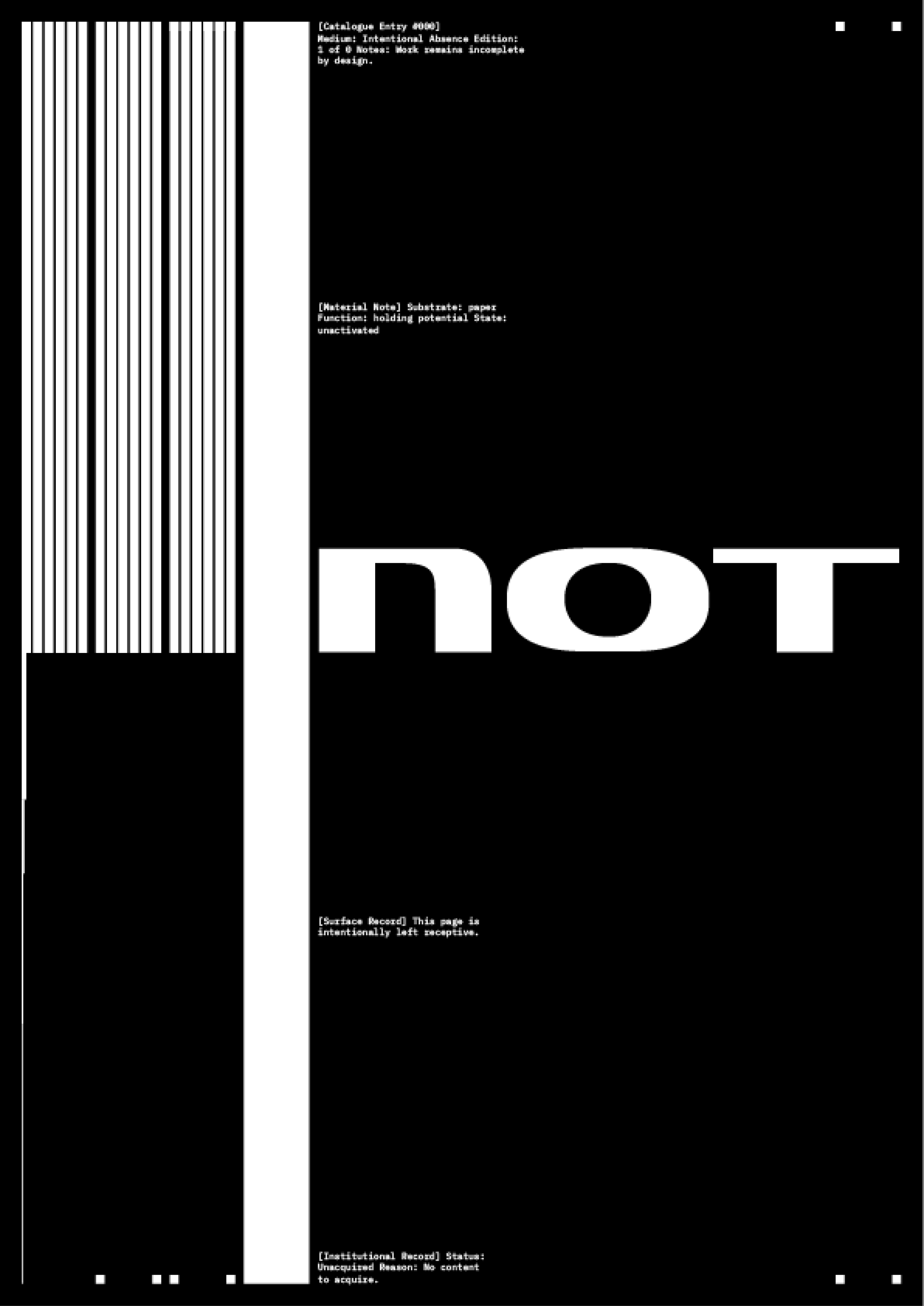
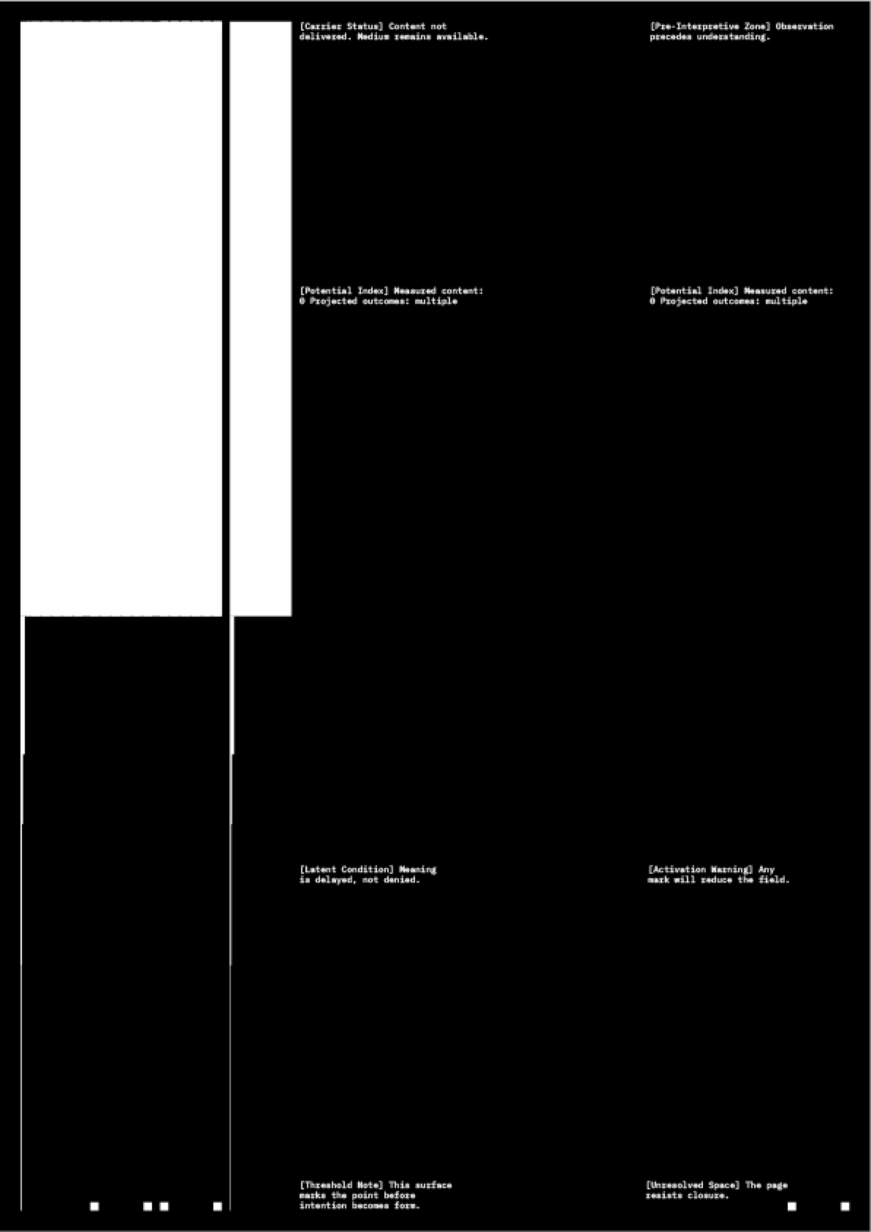
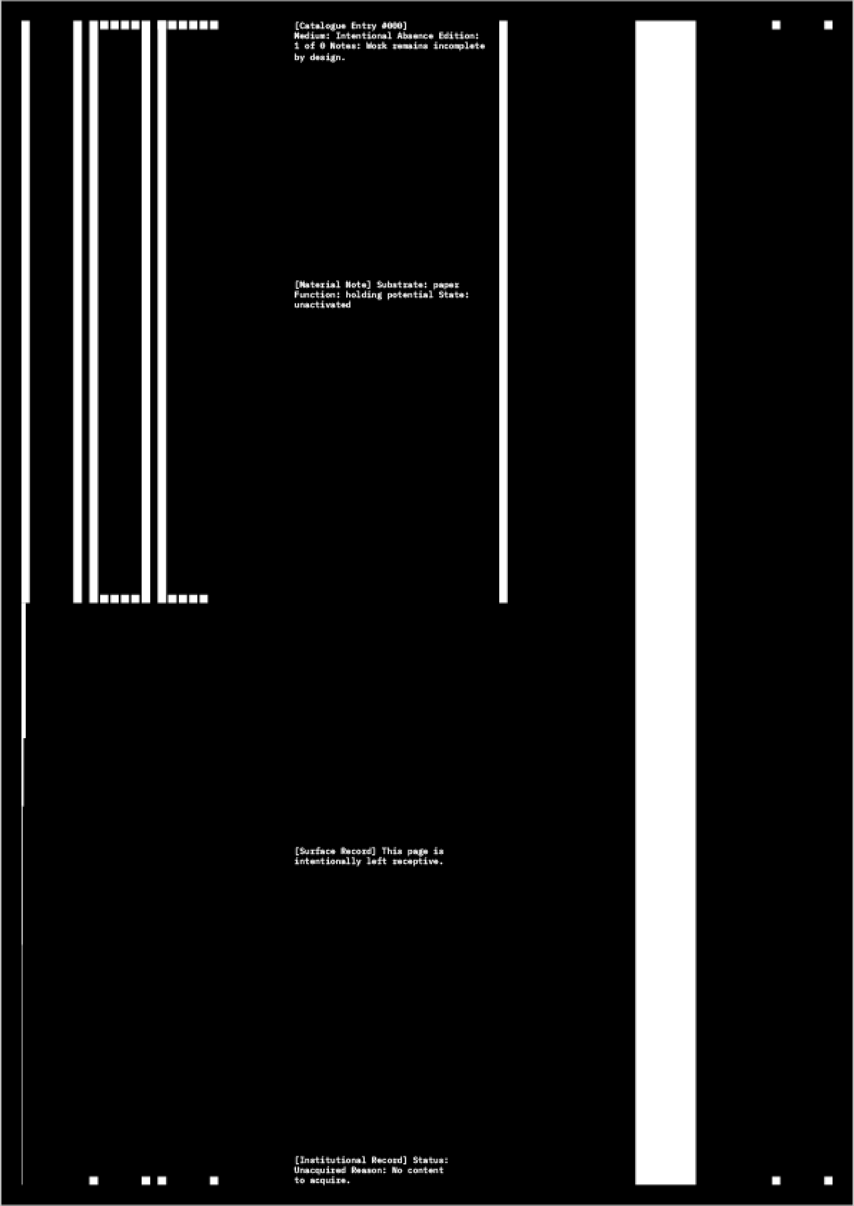
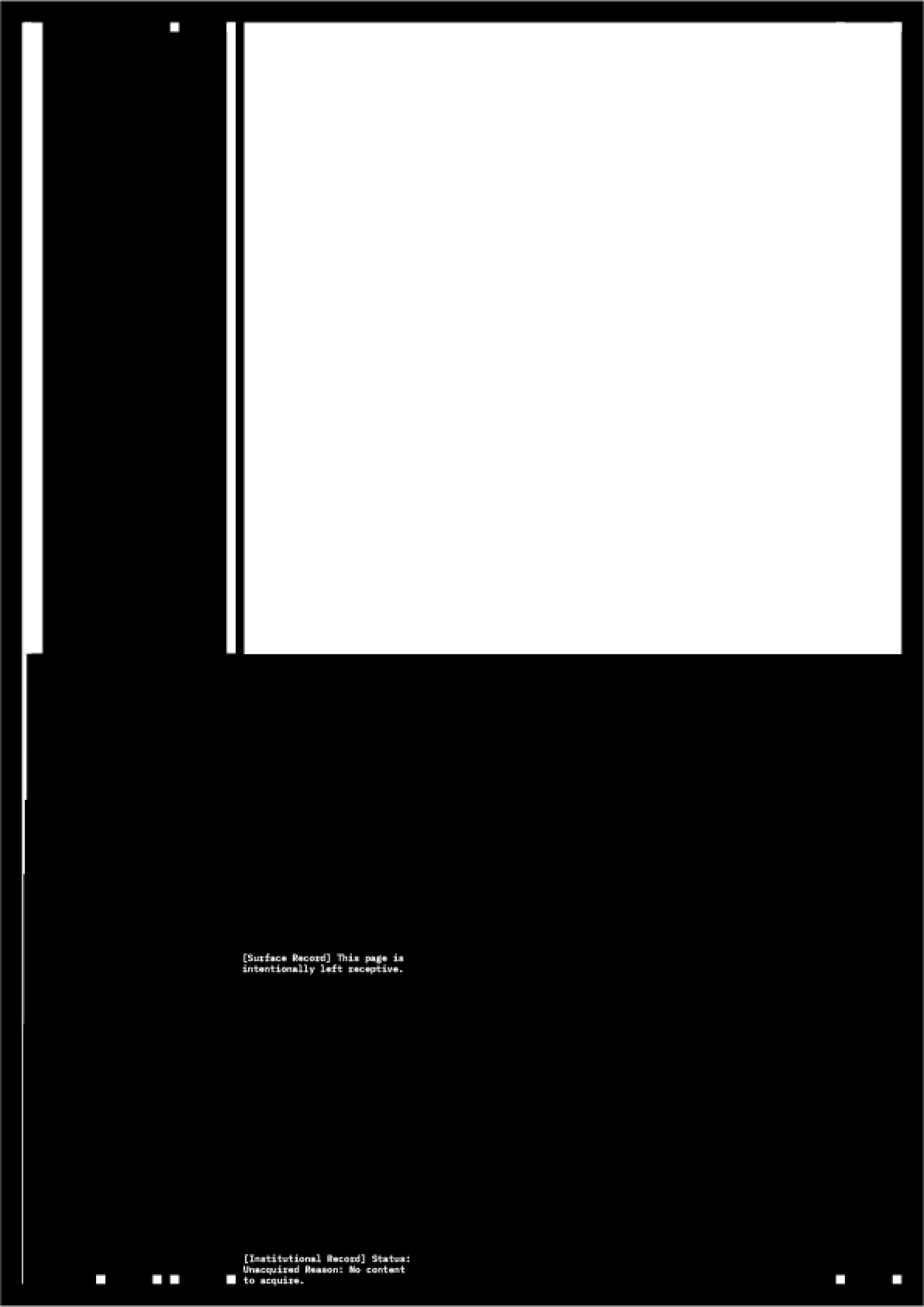
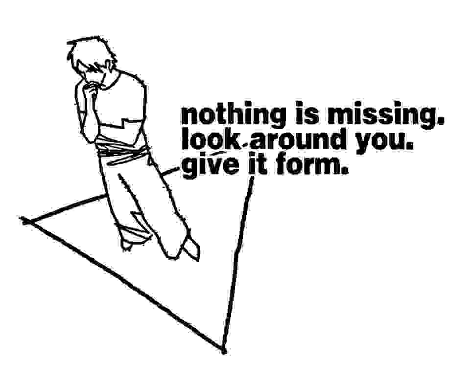
Nothing is not emptiness. It is closer to potential, the moment before something appears.
It can also mean absence. A blank space. A missing element that leaves room for interpretation.
Looking at it this way helped guide everything that followed.
Nothing creates space for interpretation
Nothing is not just emptiness. It works more like a space where different interpretations appear and exist. When something is very clearly defined, there is only one way to read it. Here there is room to bring your own meaning.
The whole idea is close to postmodern thinking. Meaning is not fixed, it depends on who is looking and from where.
Visually, that means not defining too much. Staying open. Leaving room. That openness allows it to be read in different ways, each person finding their own direction.
Translating the concept into visual ideas
From there the work moved into visual territory.
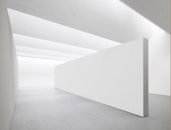
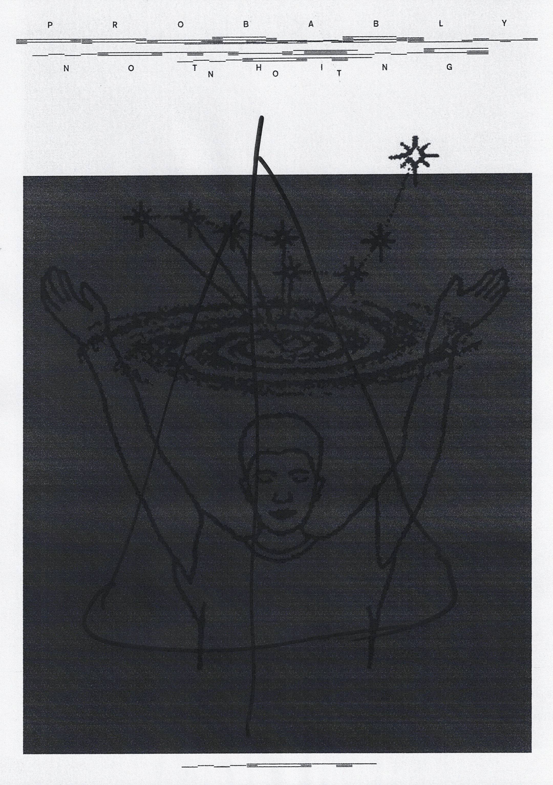
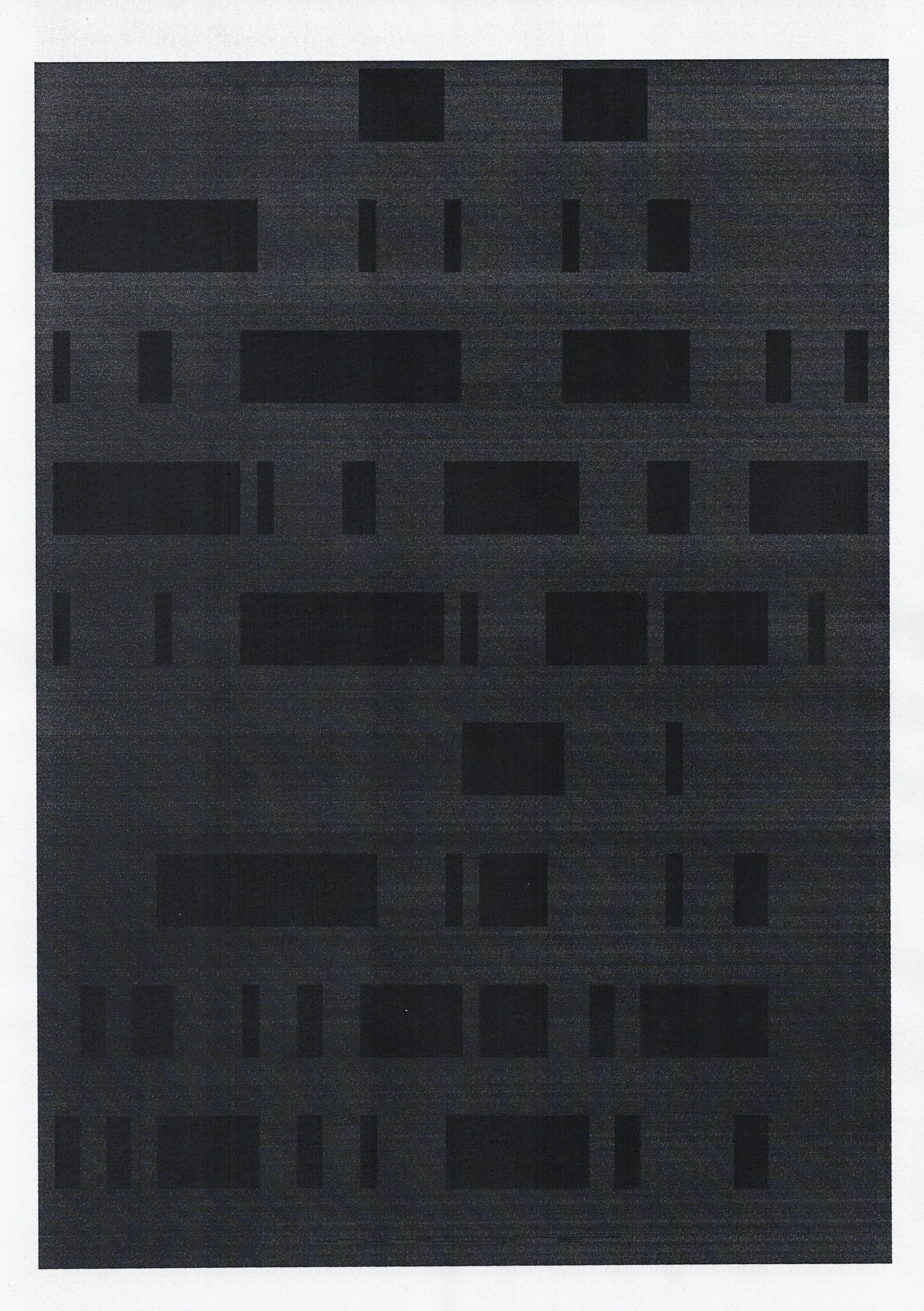
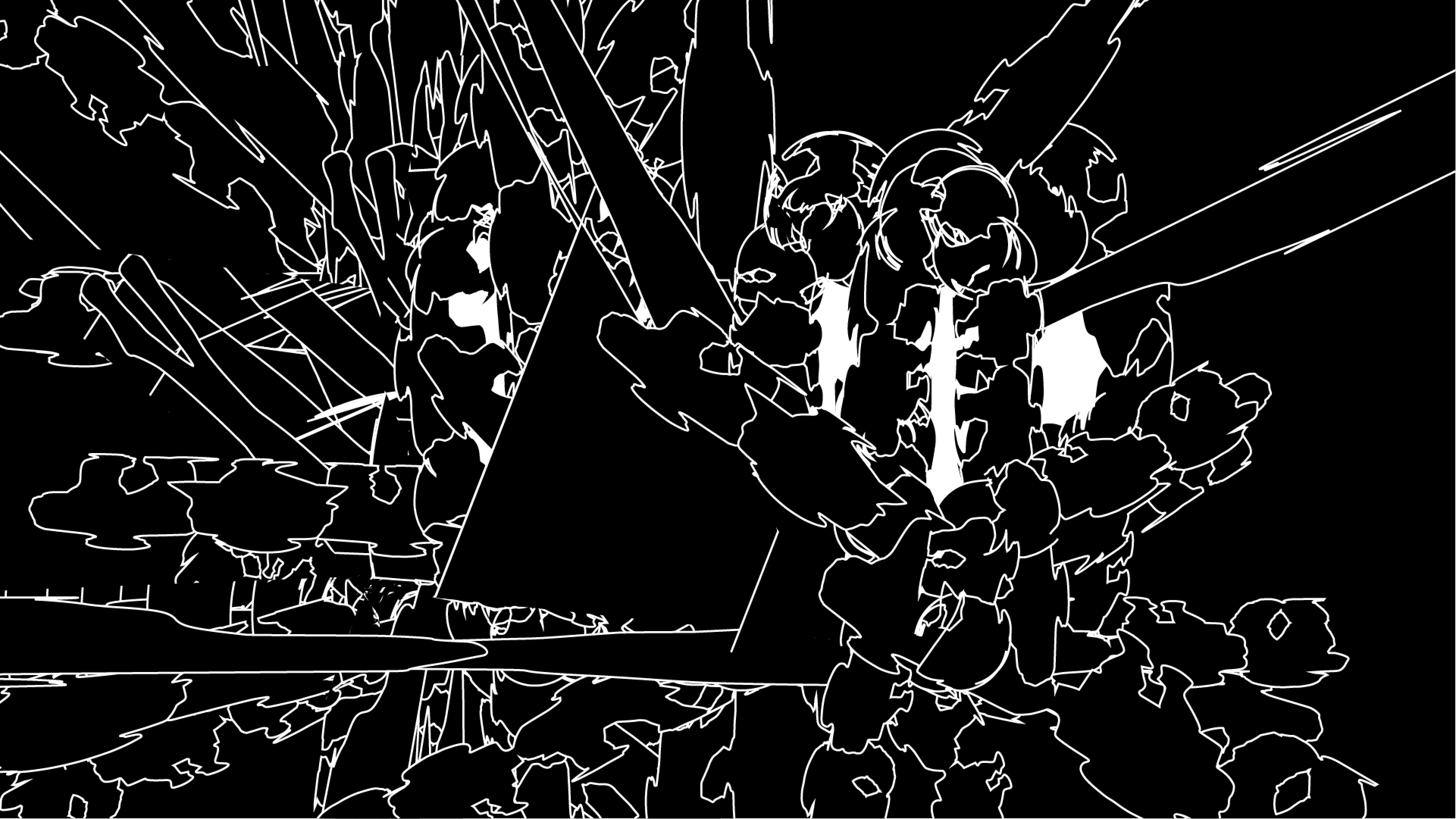
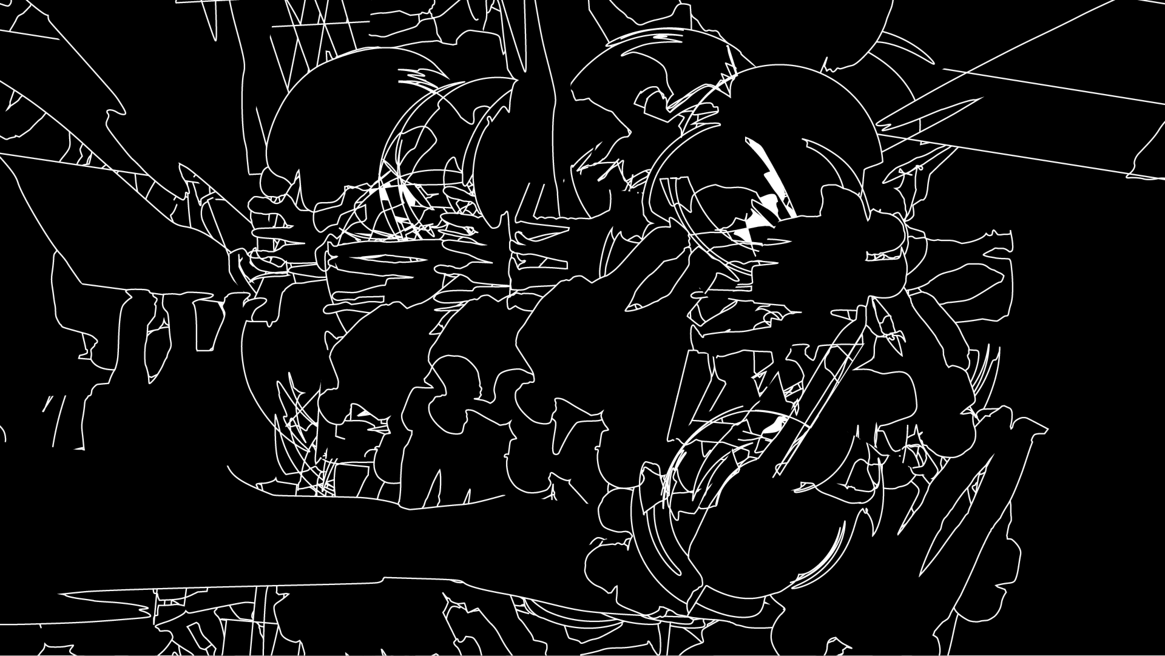
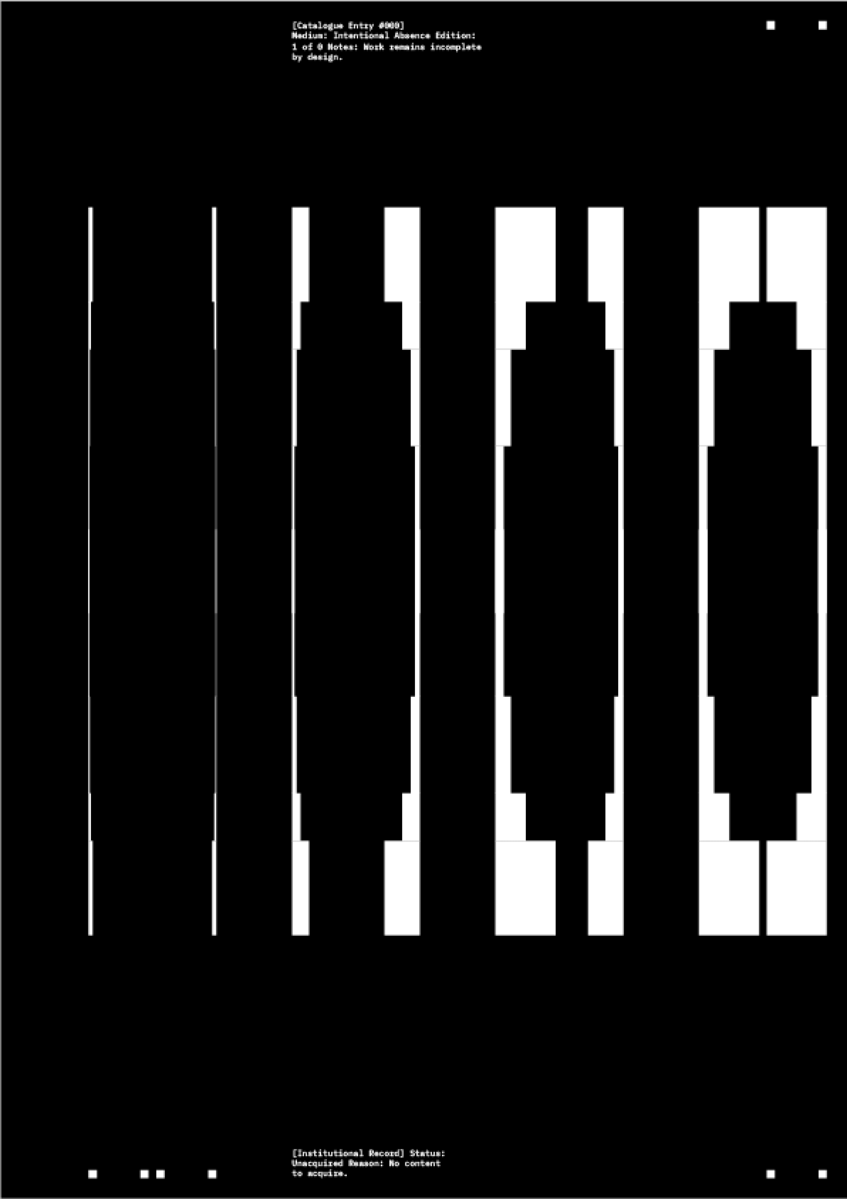
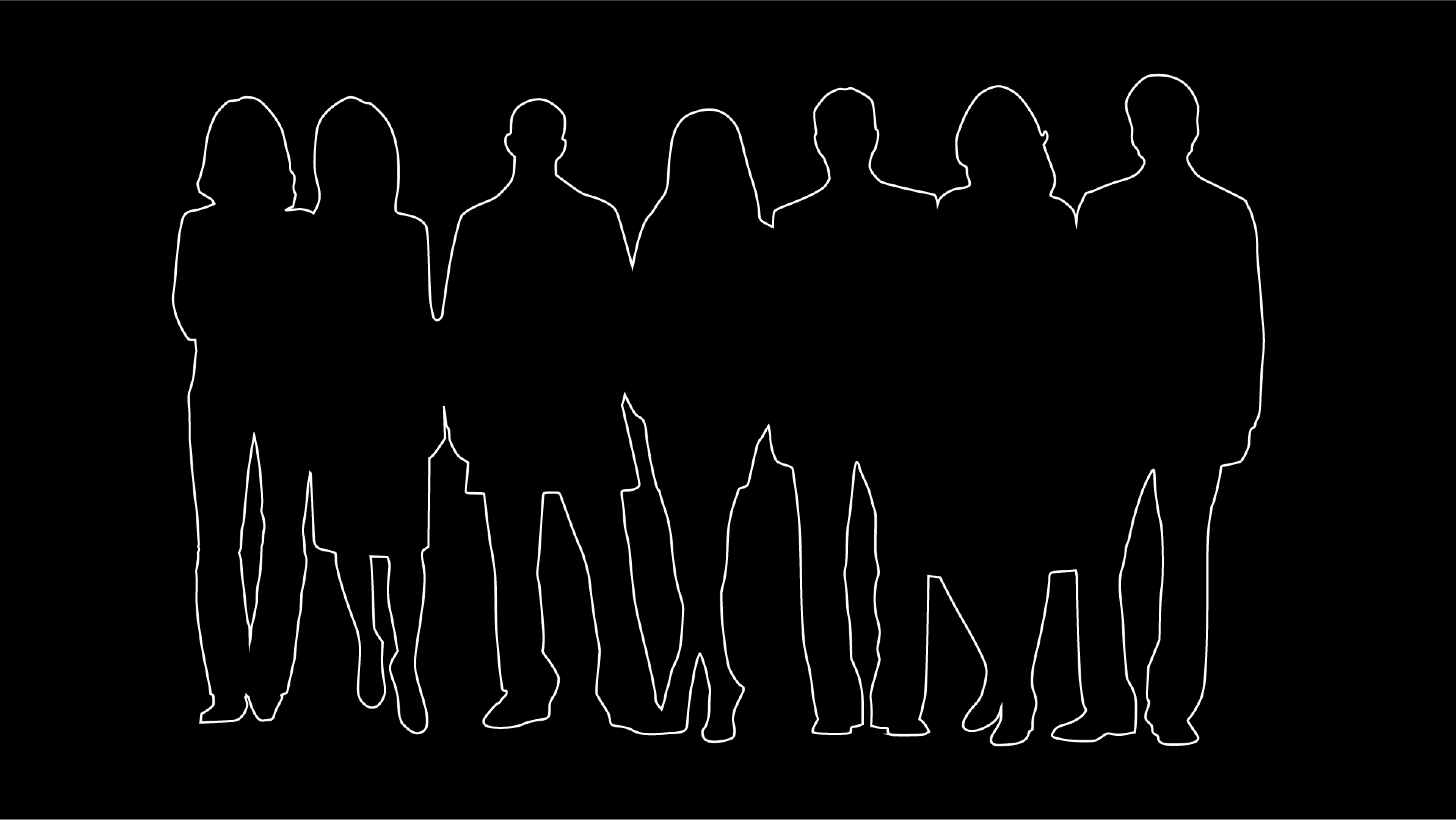
Several directions were tested. Minimal structures. Empty space. Reduced elements. Unfinished compositions.
Things that suggest rather than show.
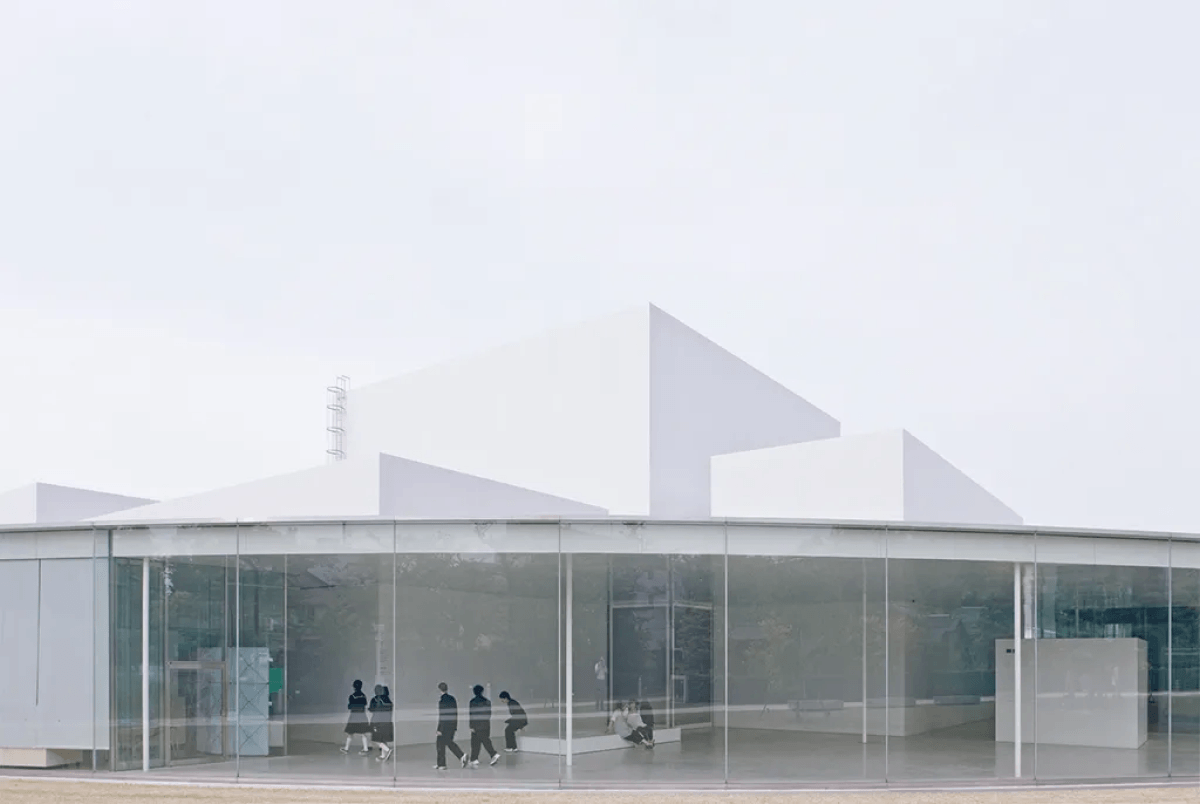
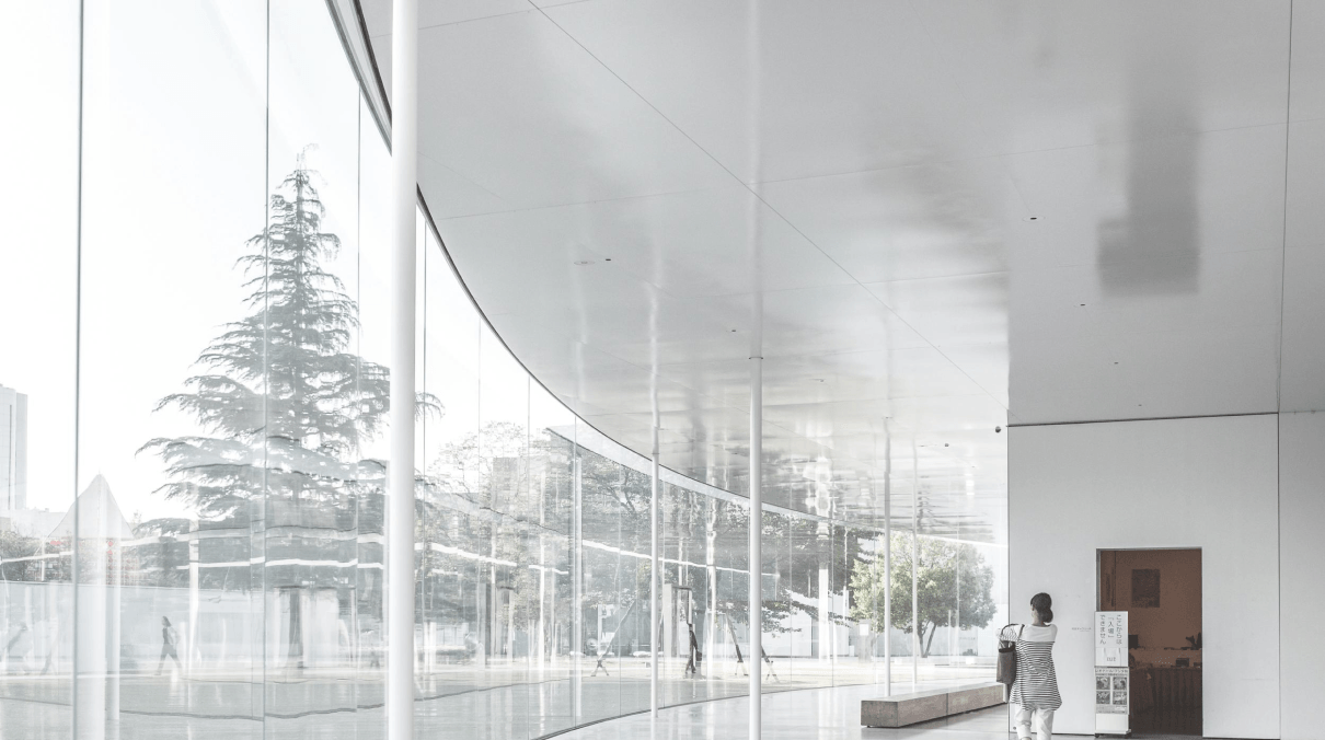
The aim was not to illustrate the word literally. It was more about finding visual states that feel like openness, silence, anticipation.
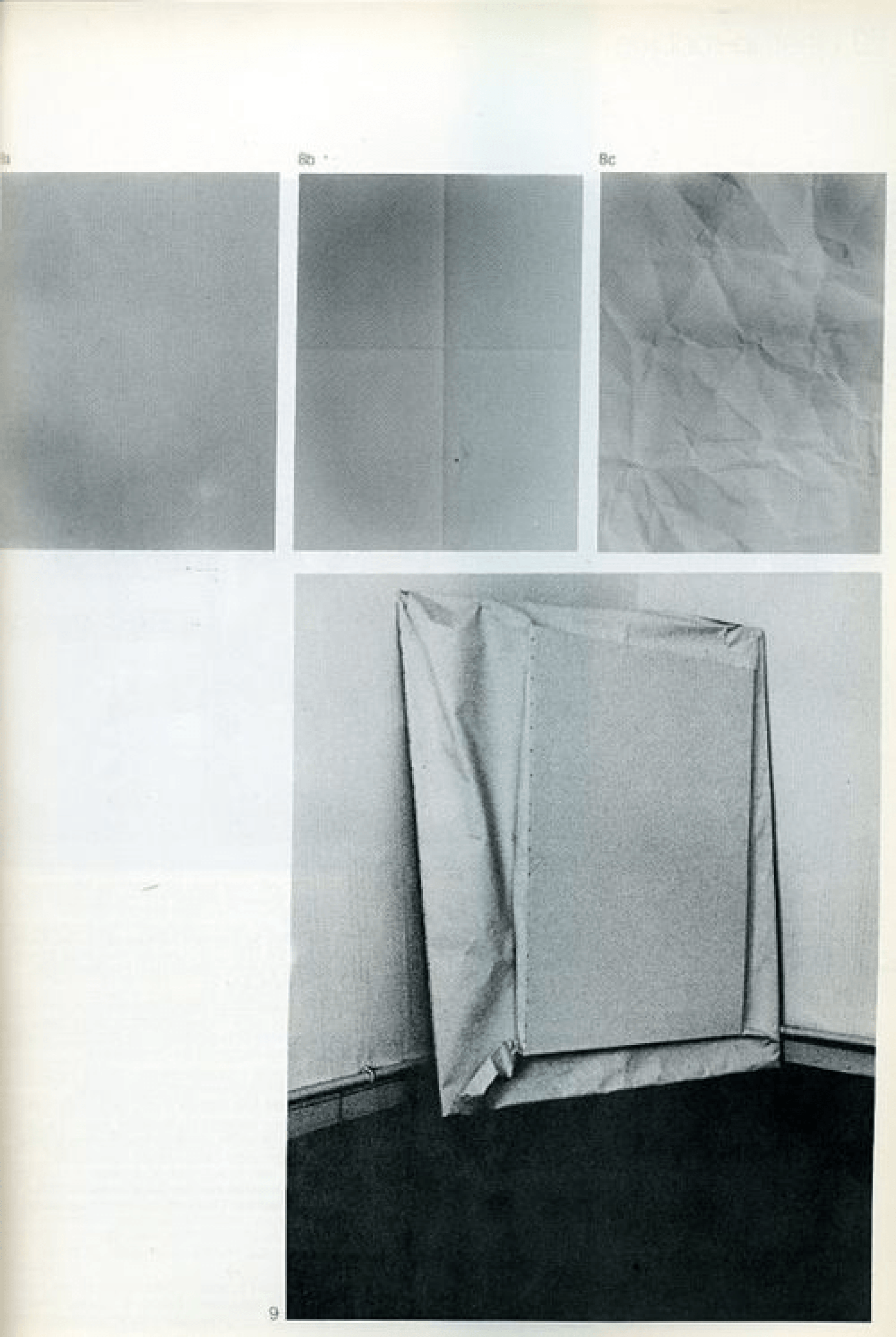
From these experiments some themes kept coming back.
Simplicity.
Contrast.
Spatial tension.
Some of them later became early layout directions for posts, interviews and other formats within the project.
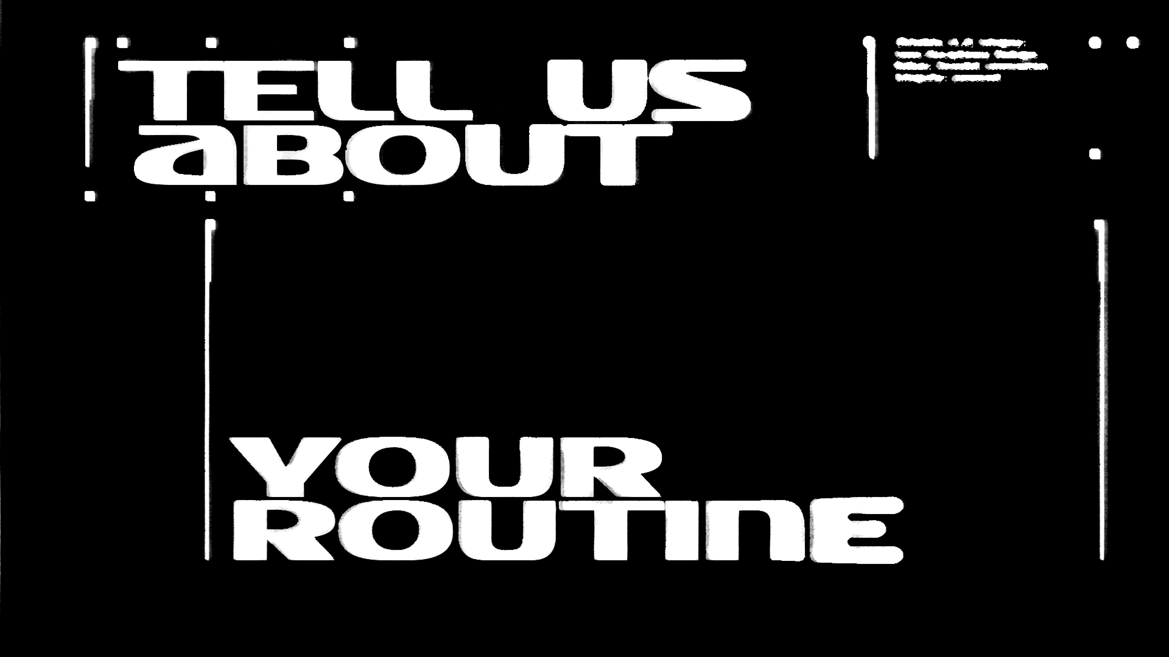
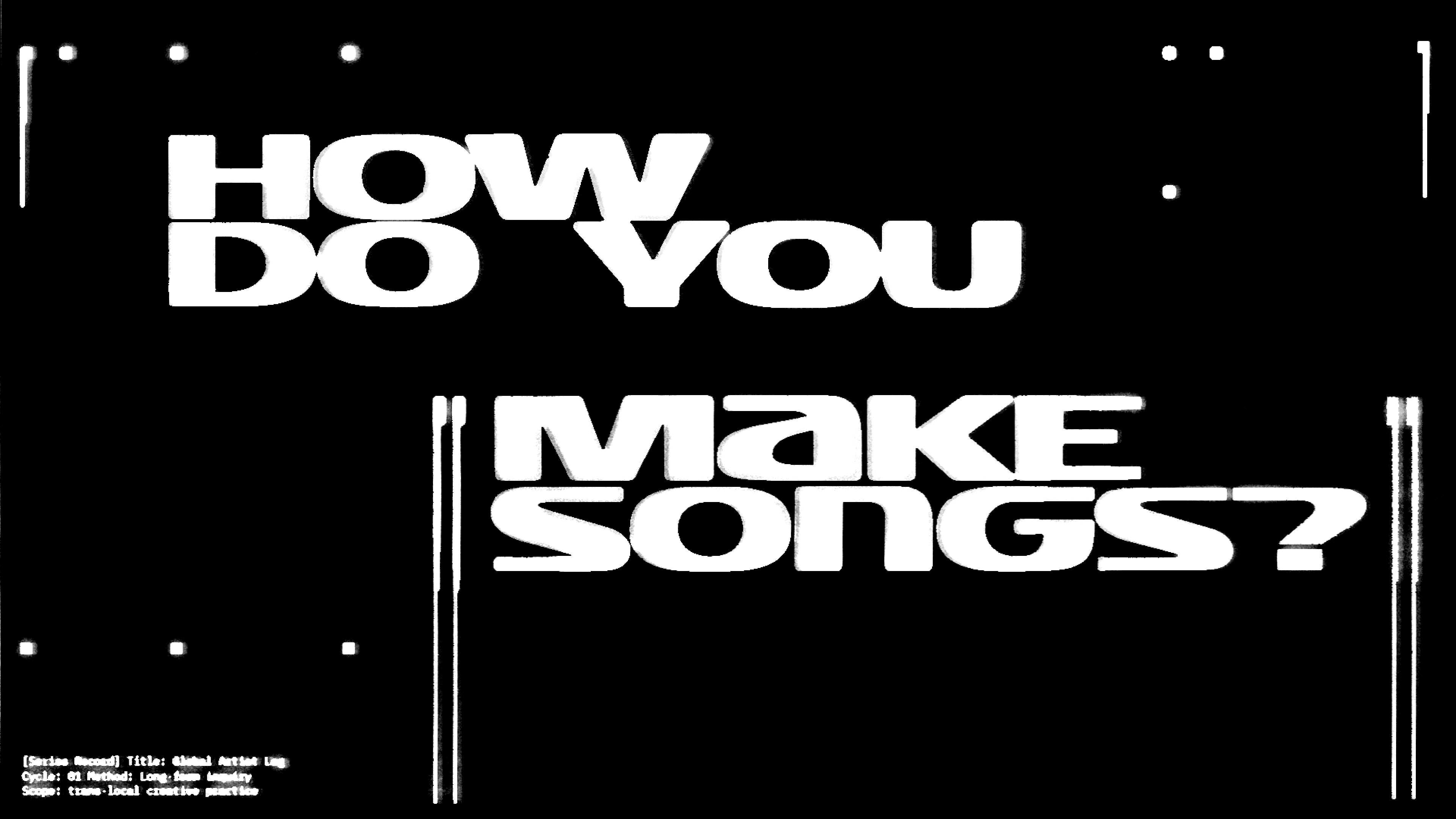
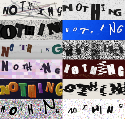
Typography as structure
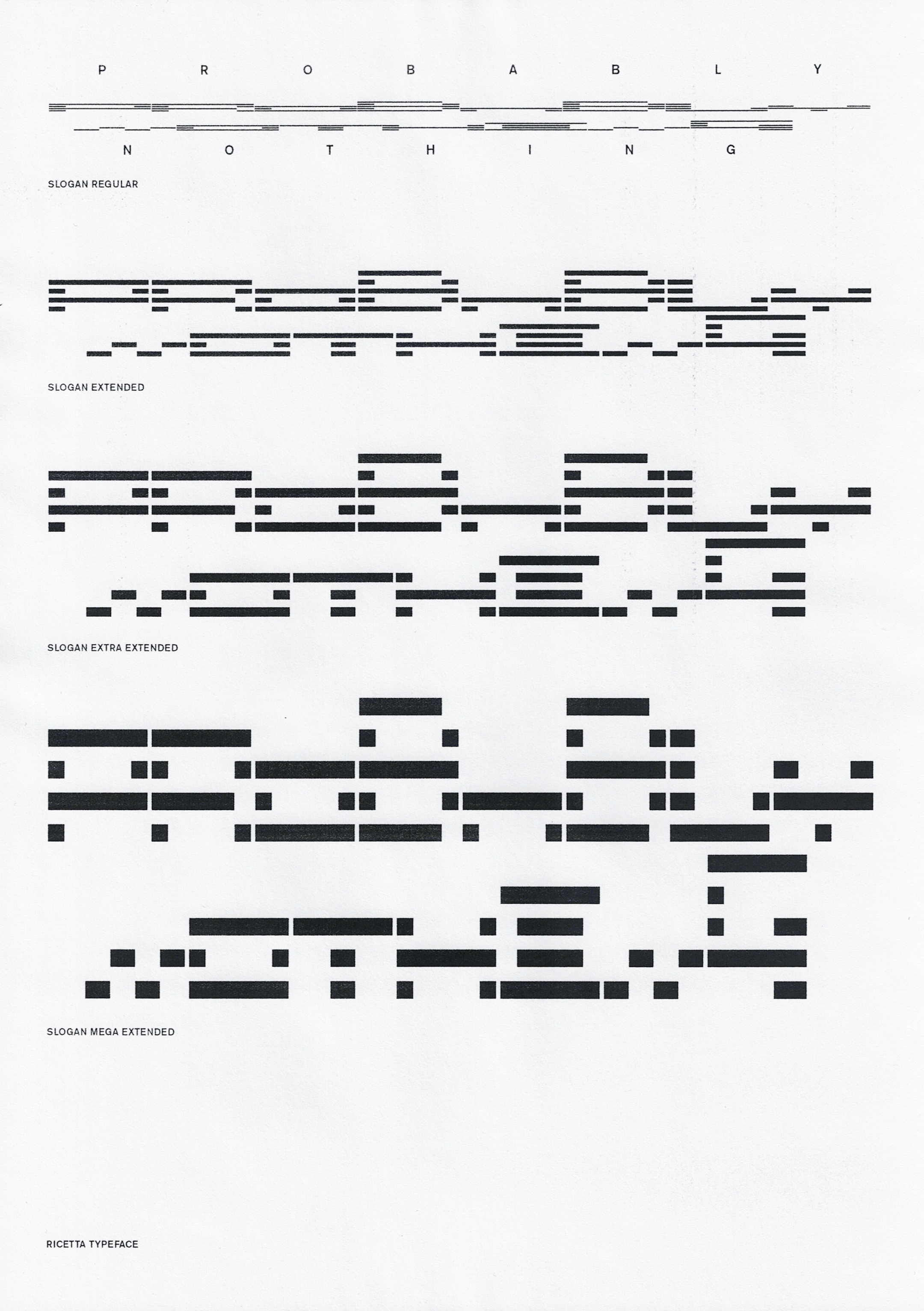
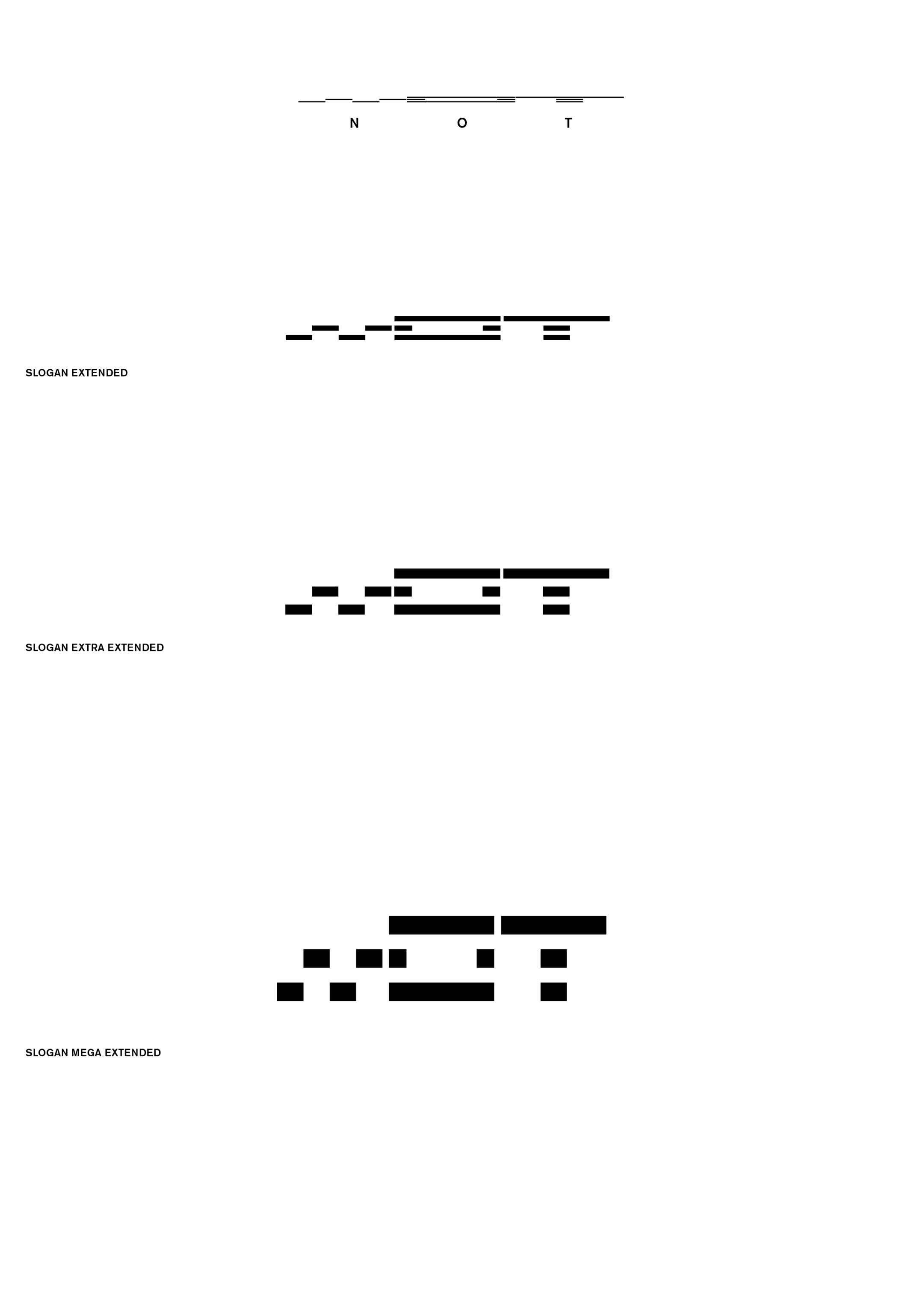
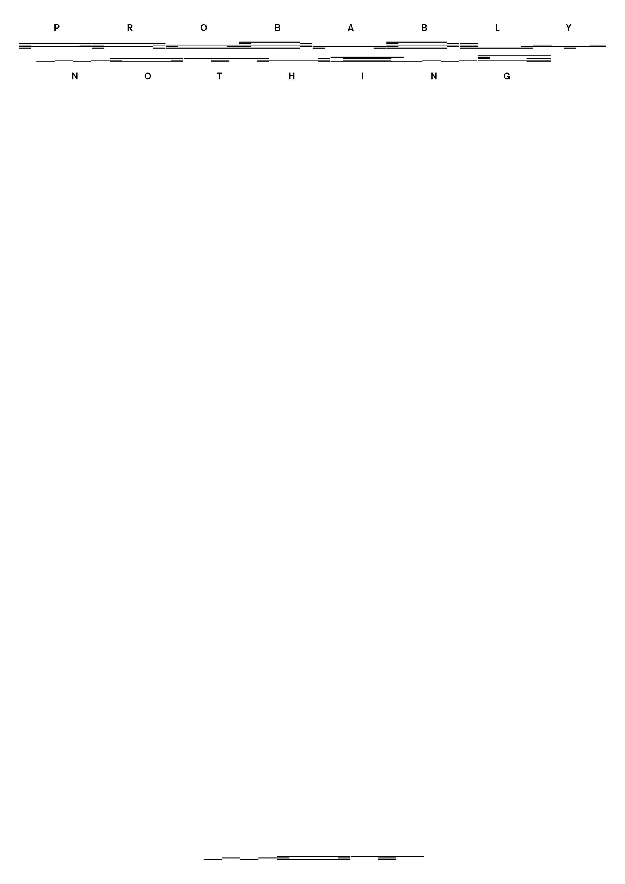
What happens when text stops behaving like text?
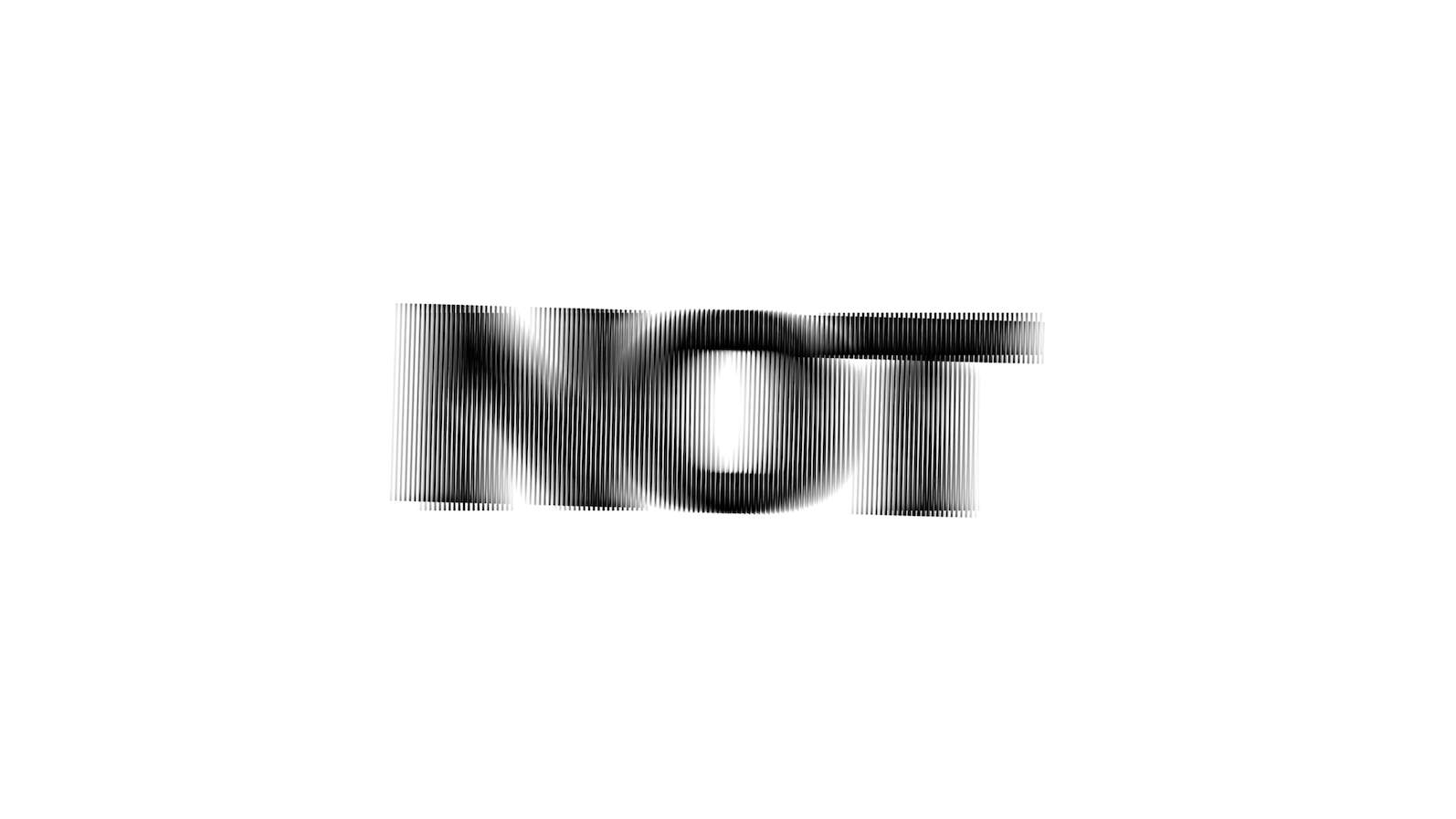
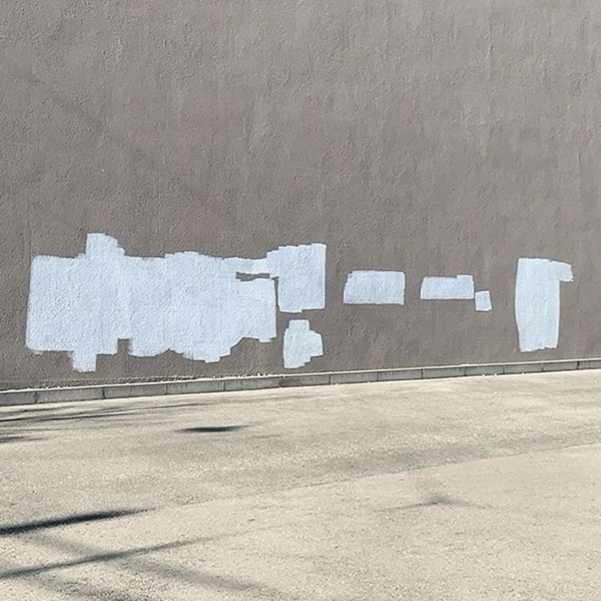
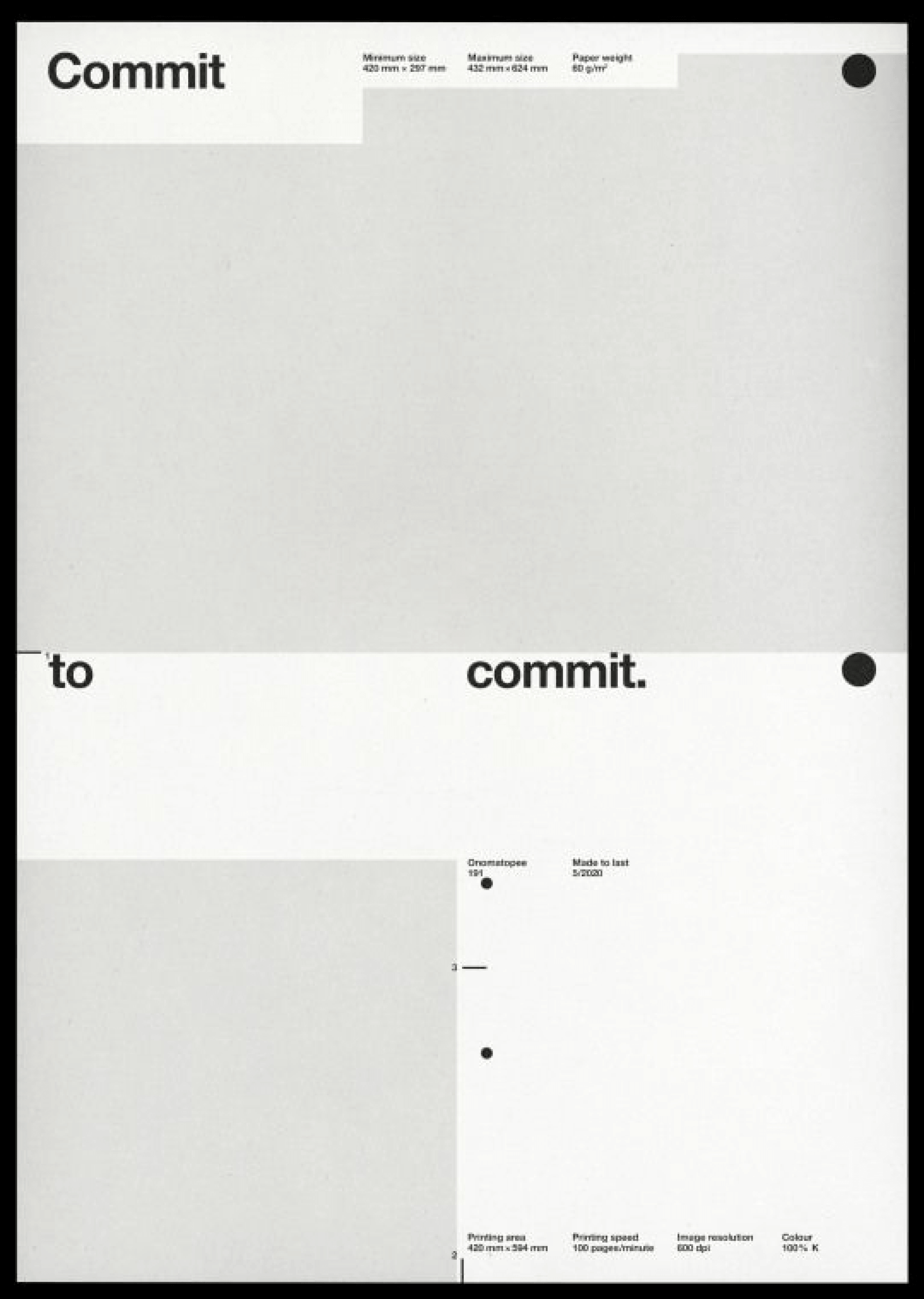
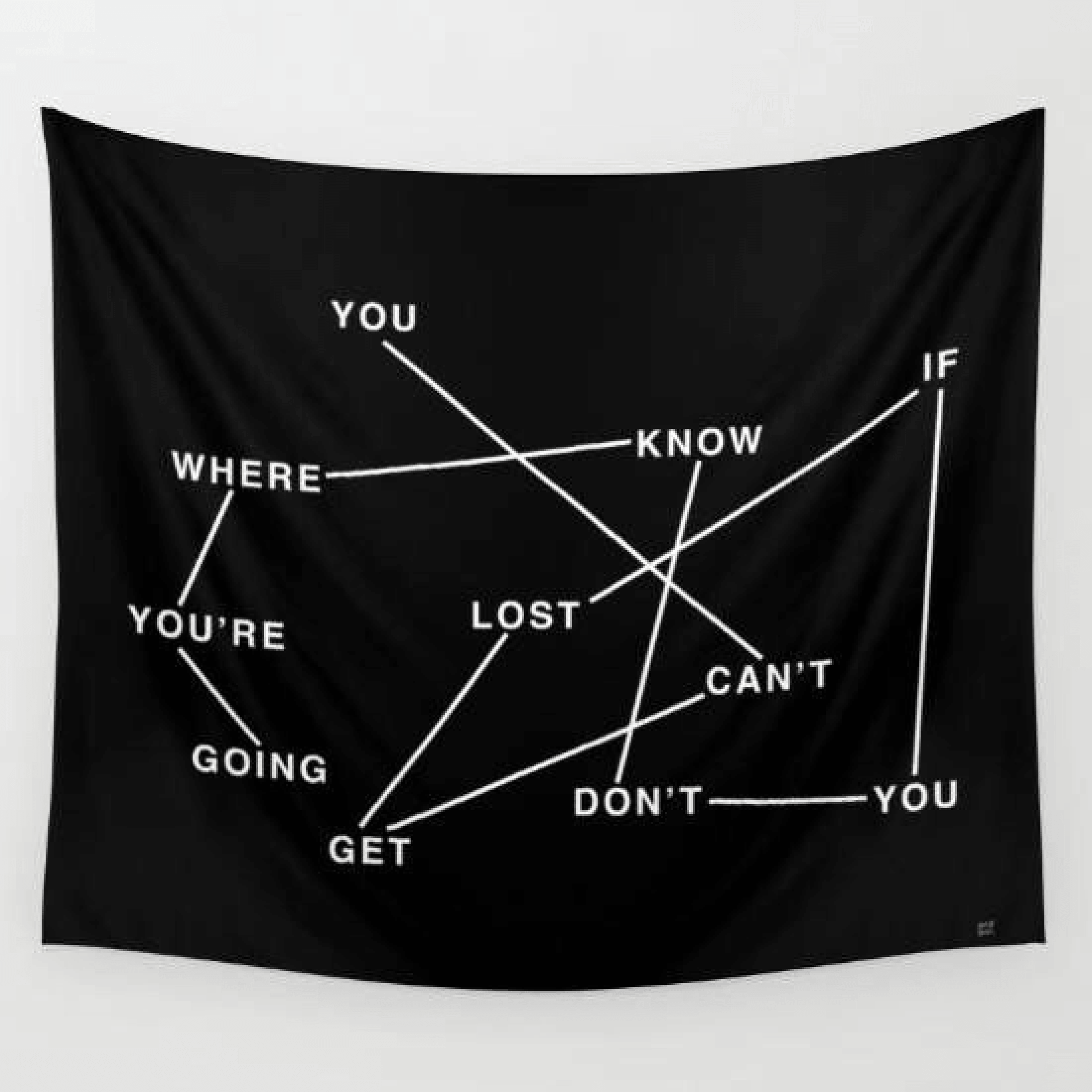
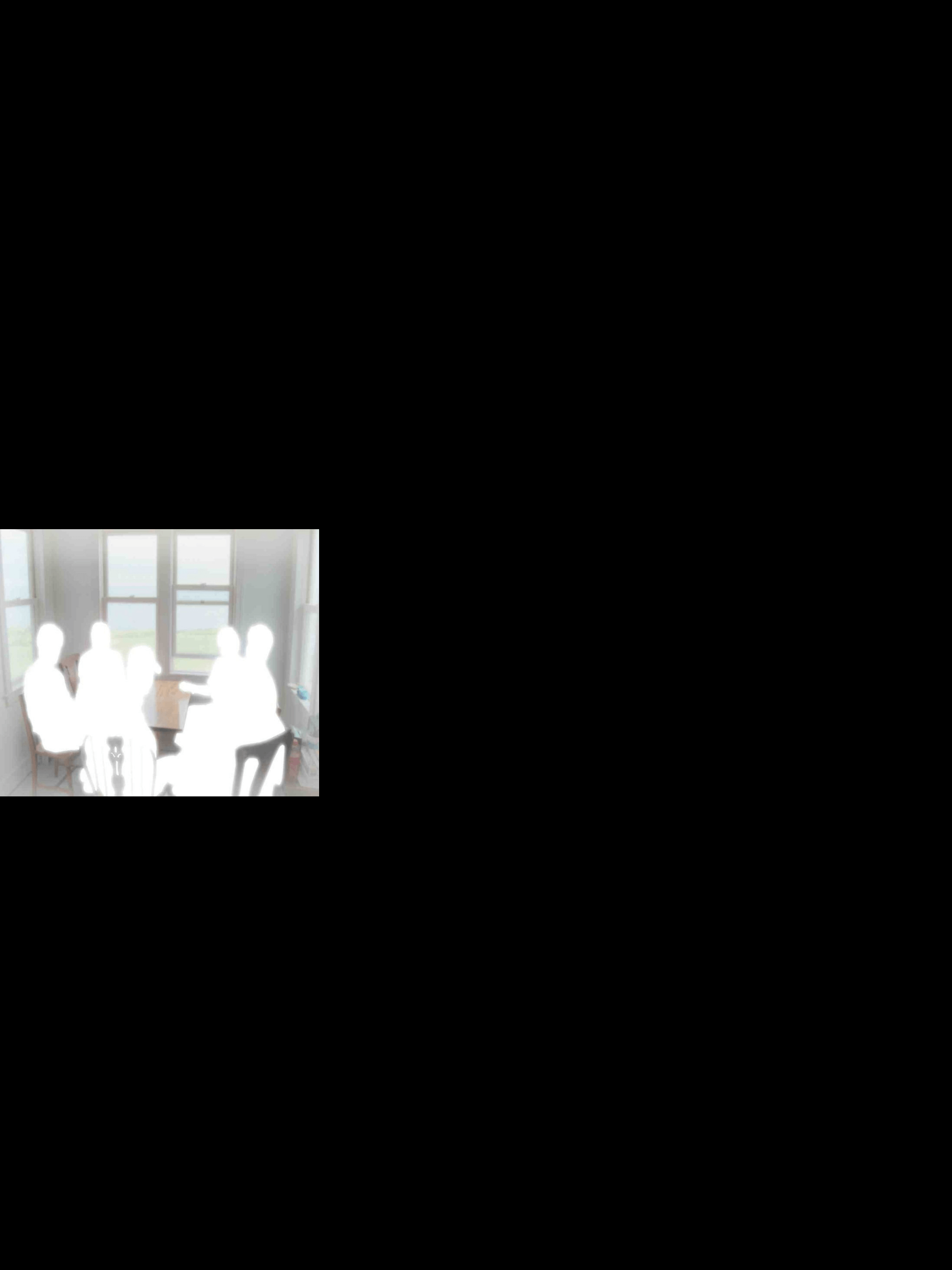
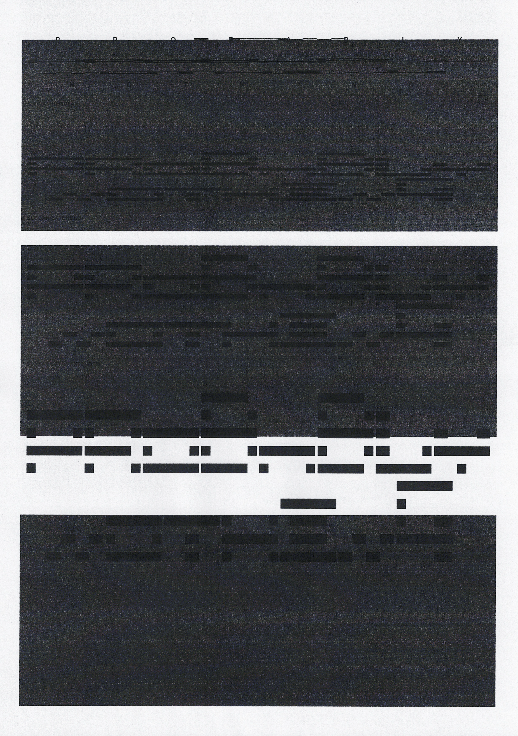
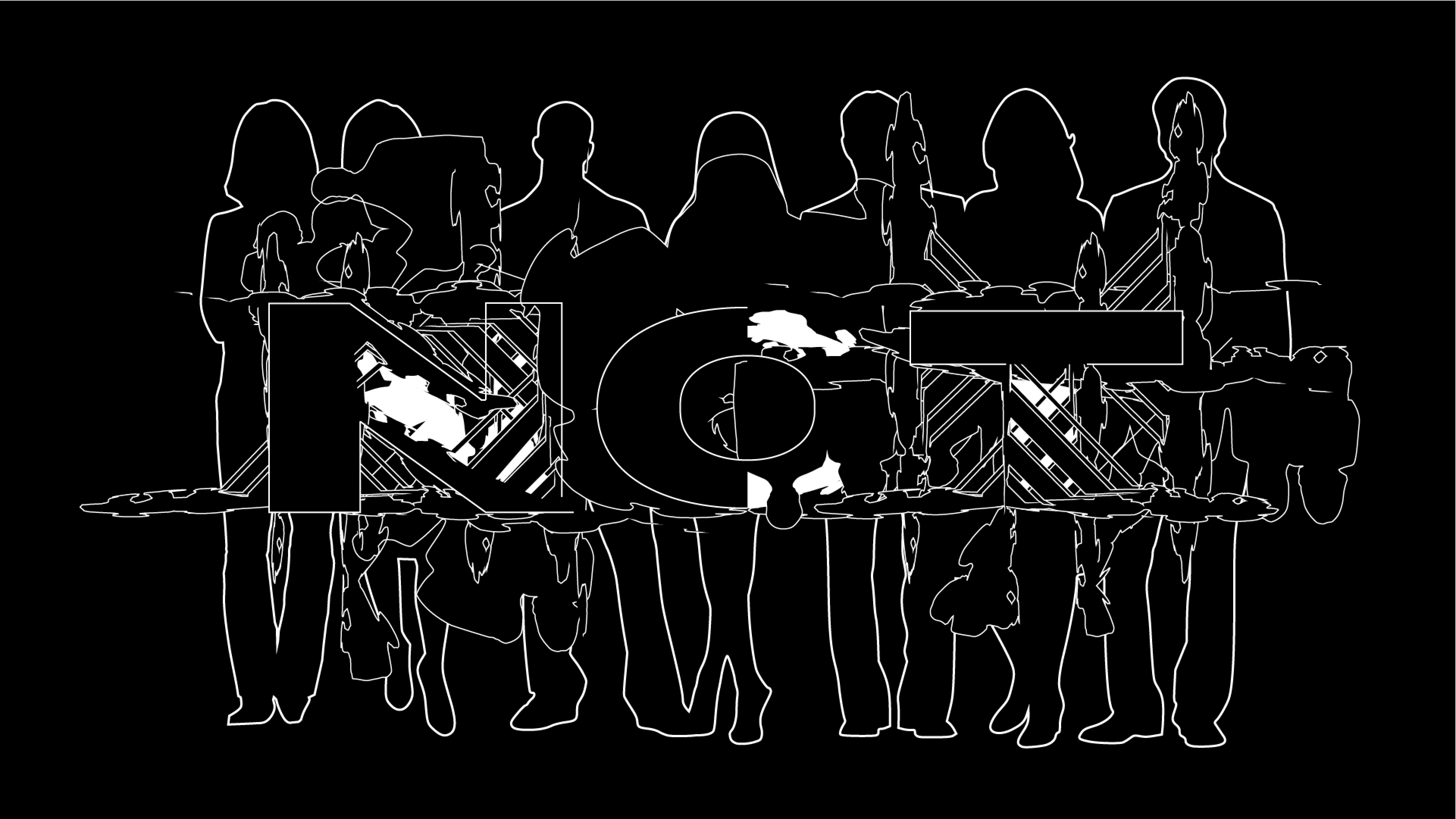
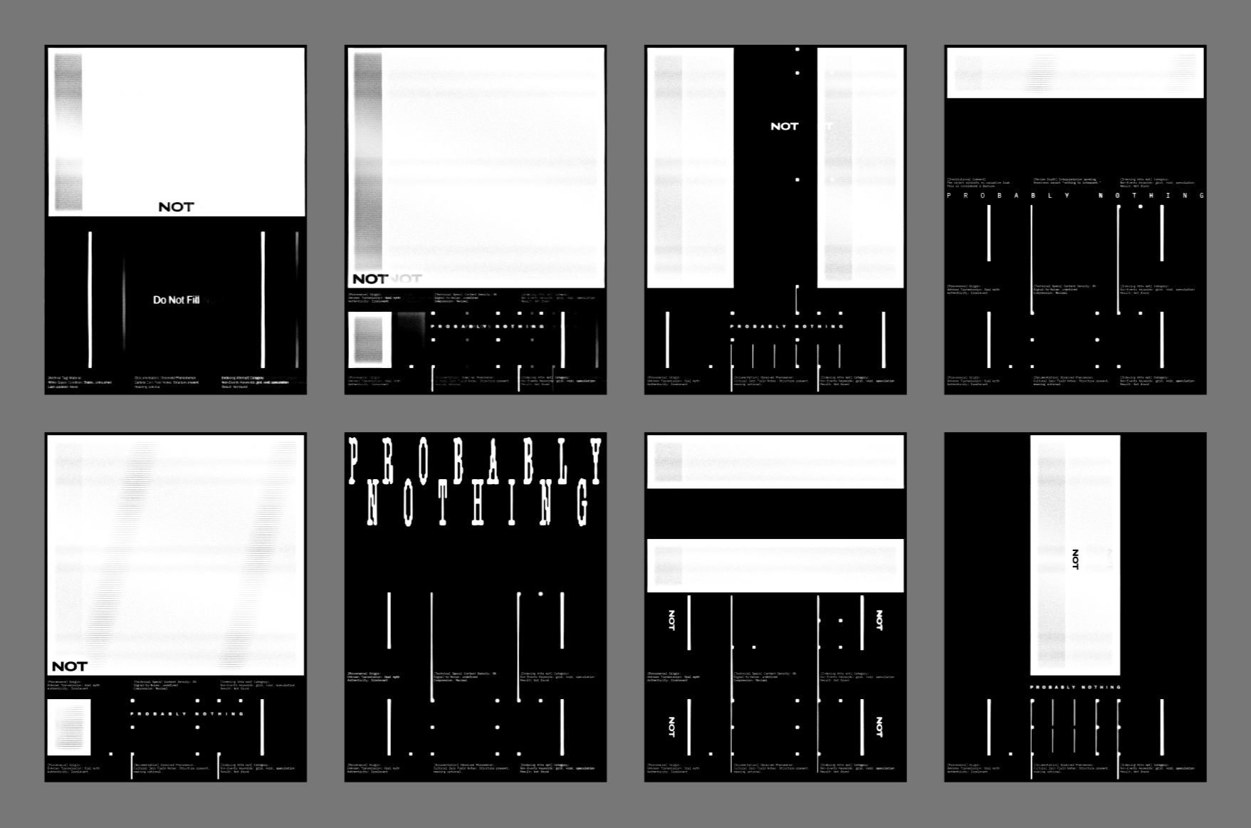
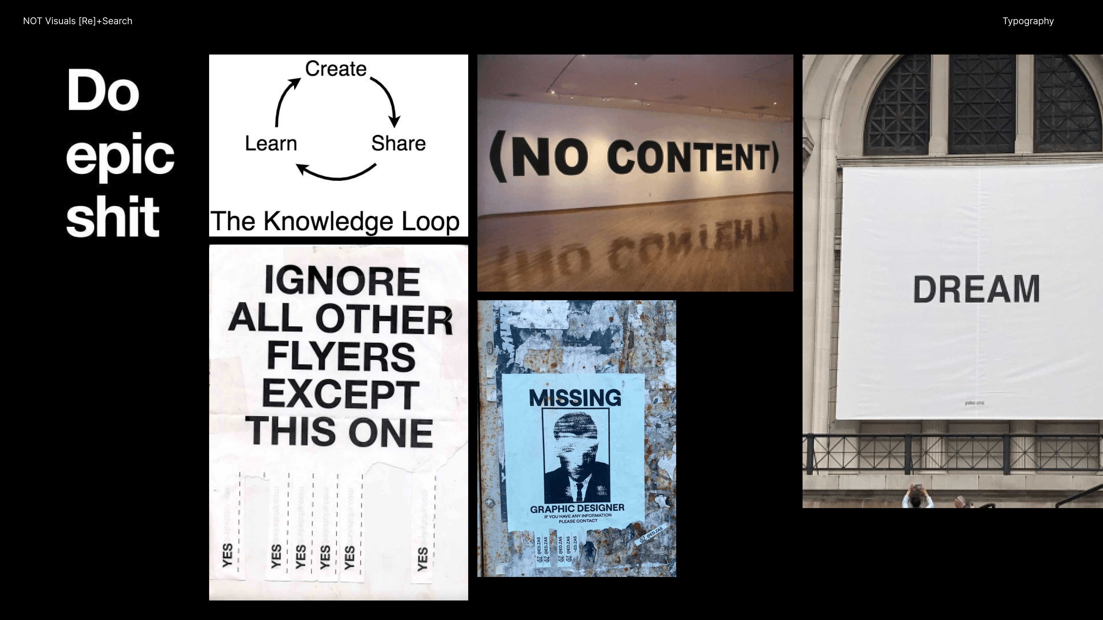
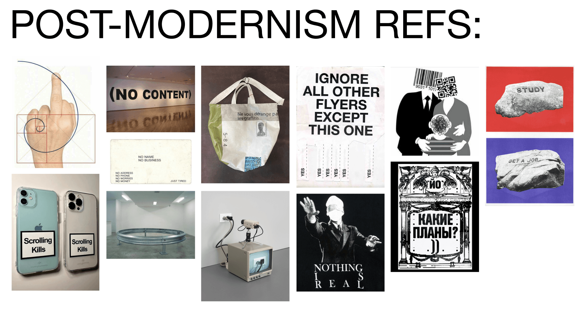
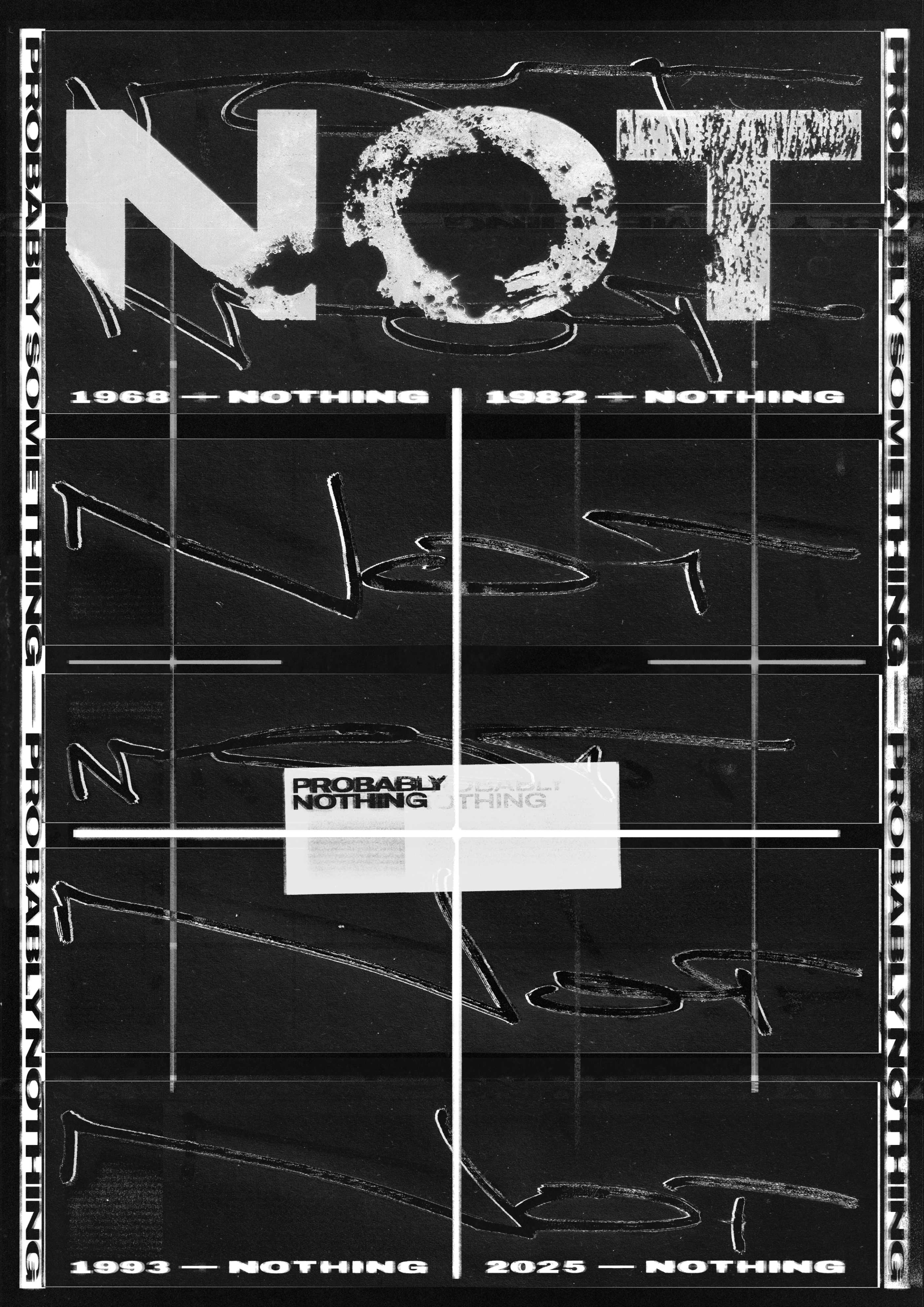
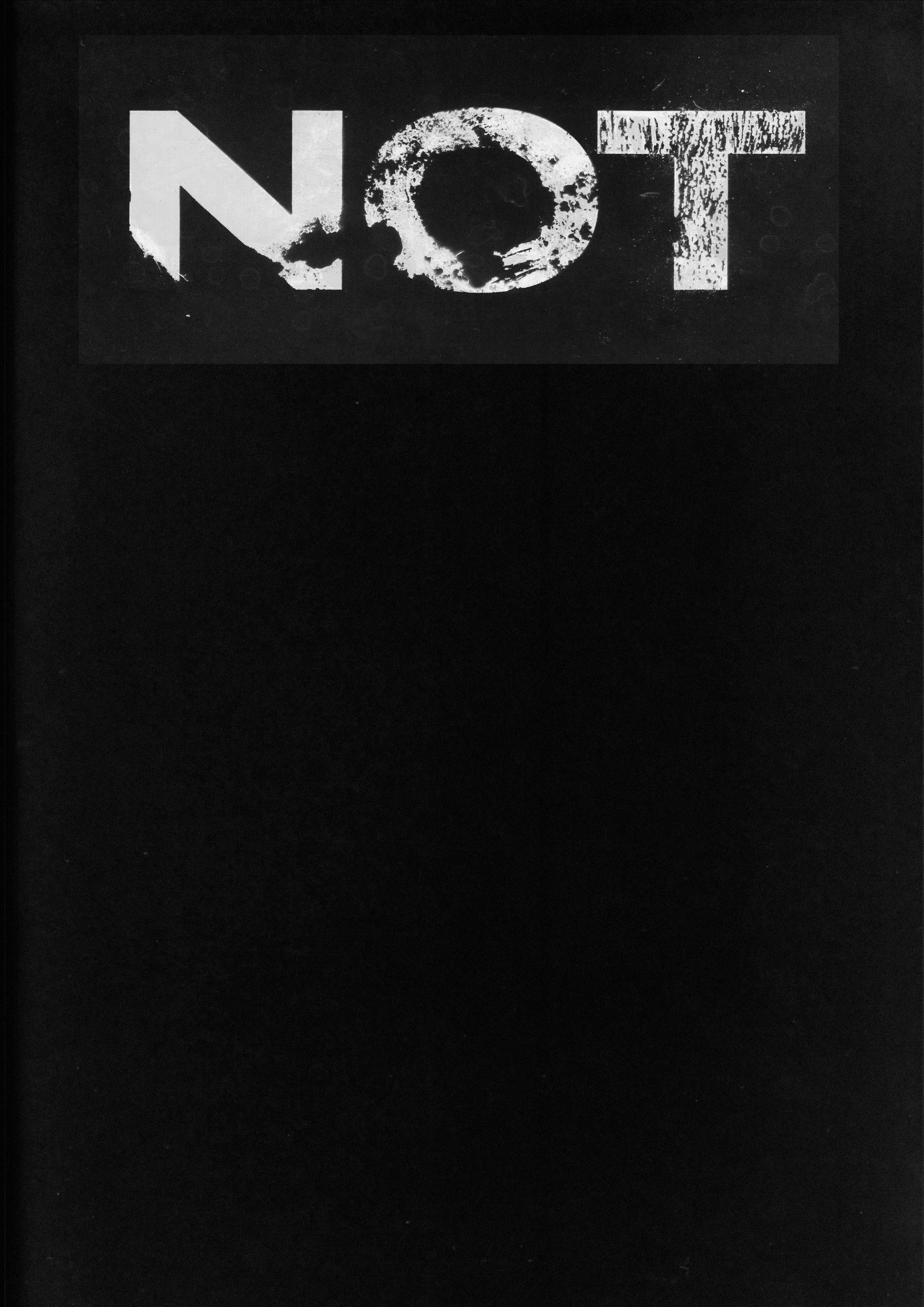
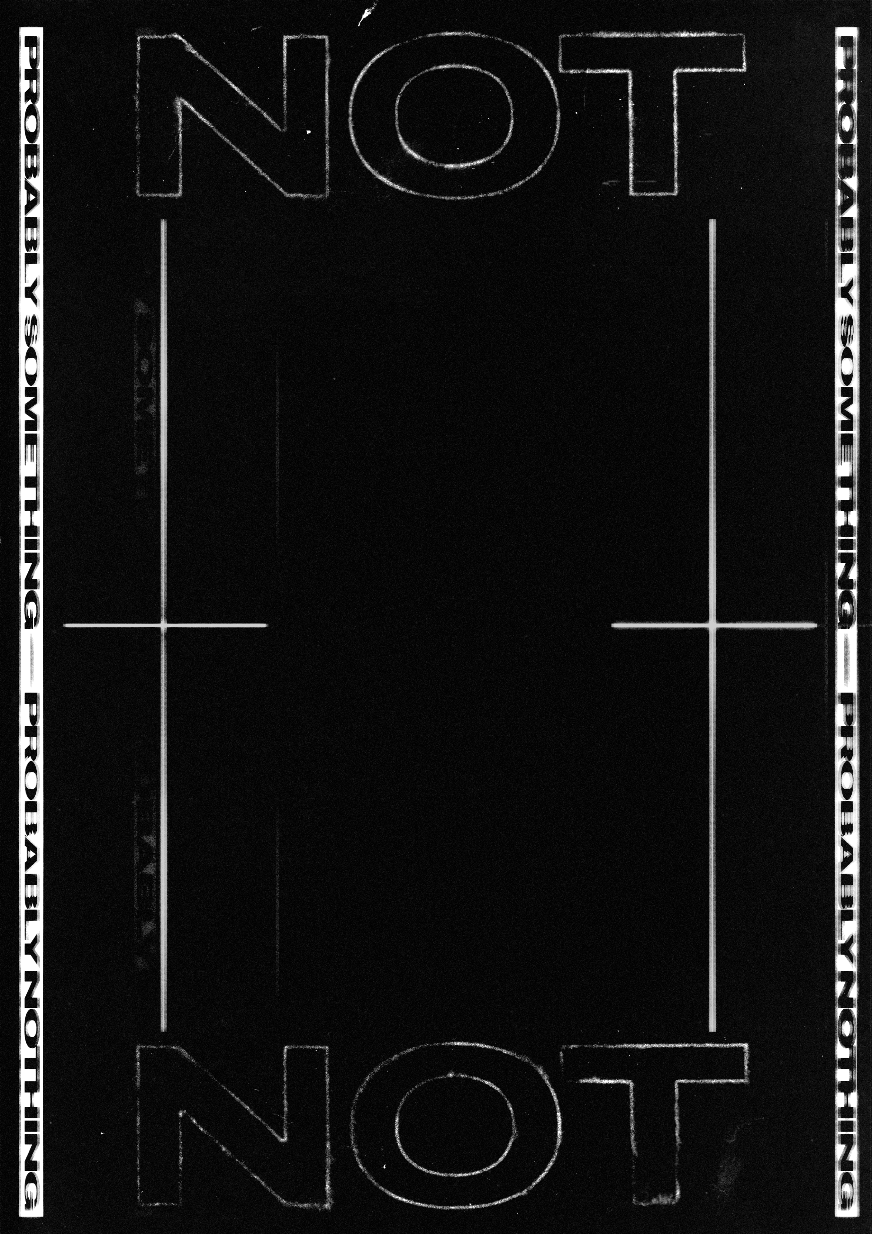
One direction was obliteration. Erasing or masking parts of a word until it becomes harder to read. The text is still there, you just cannot fully read it. It turns into something closer to a trace than a message.
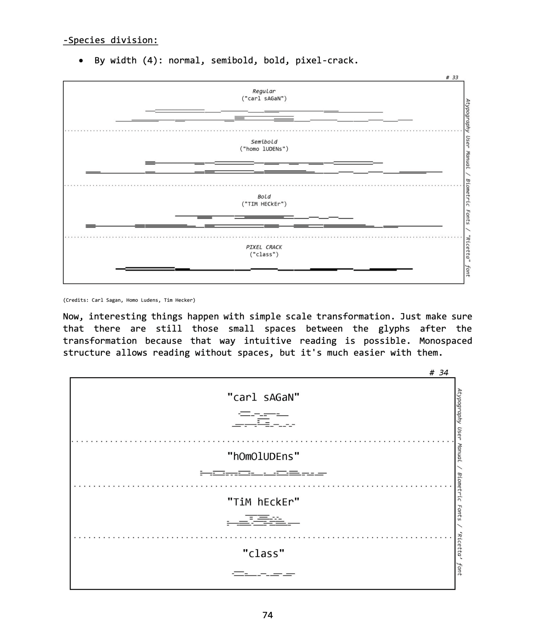
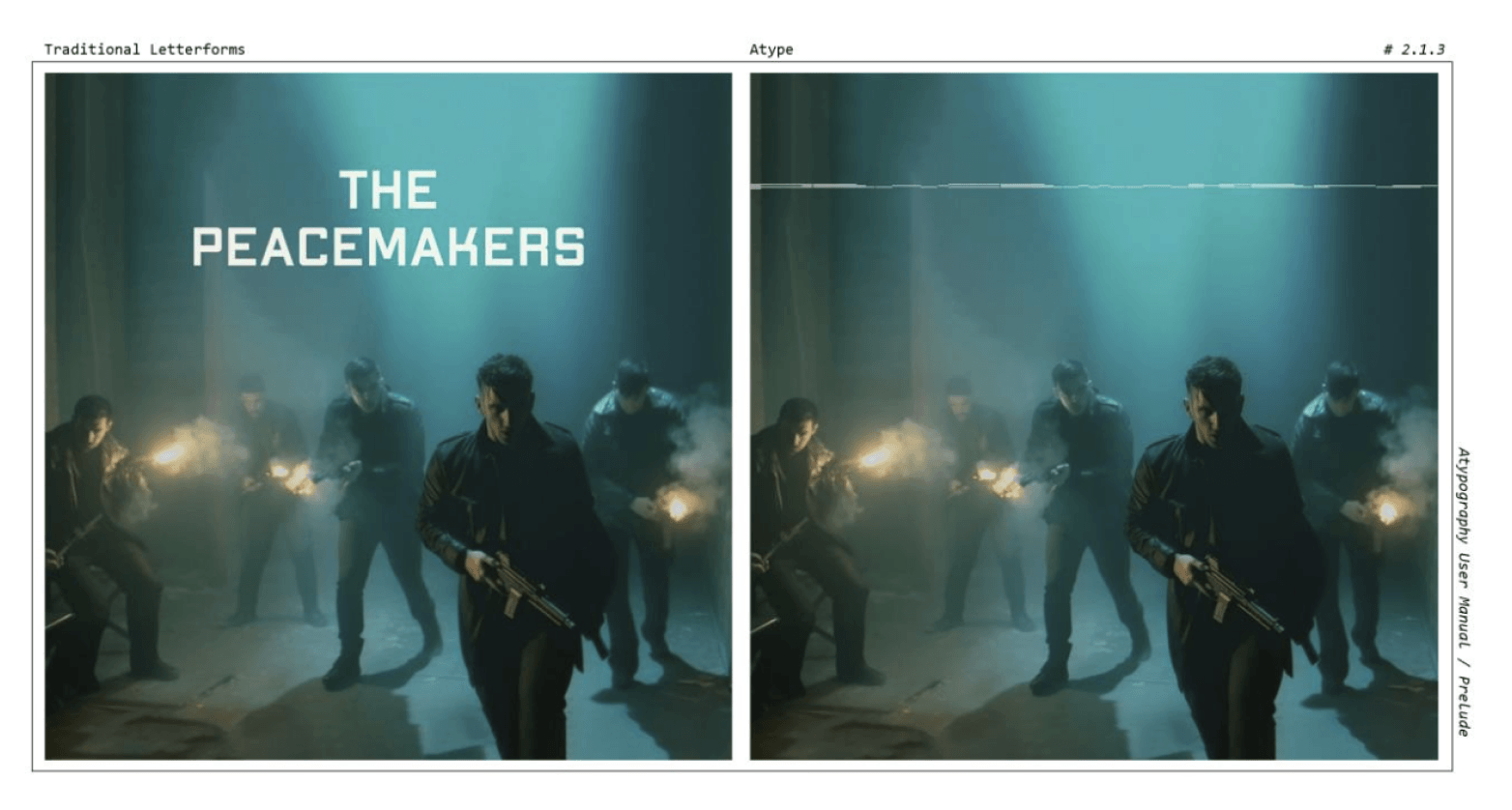
This connects to experimental typography movements like Atypography, where letters disappear into structures and patterns. Reading is not the point. Being seen is.
It shifts the role of text. Instead of delivering information, the word becomes a visual element. It blends into space, structure, image.
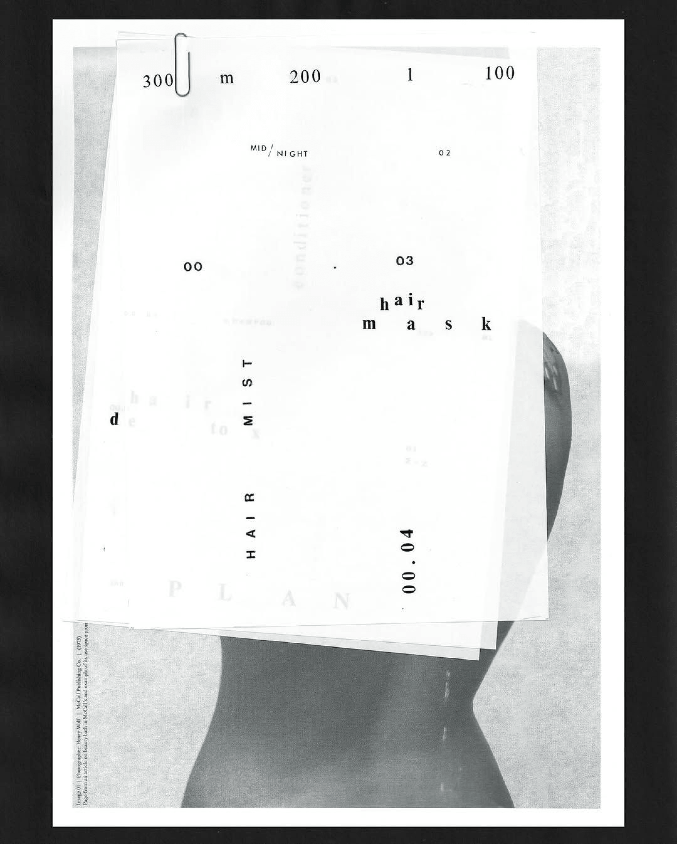
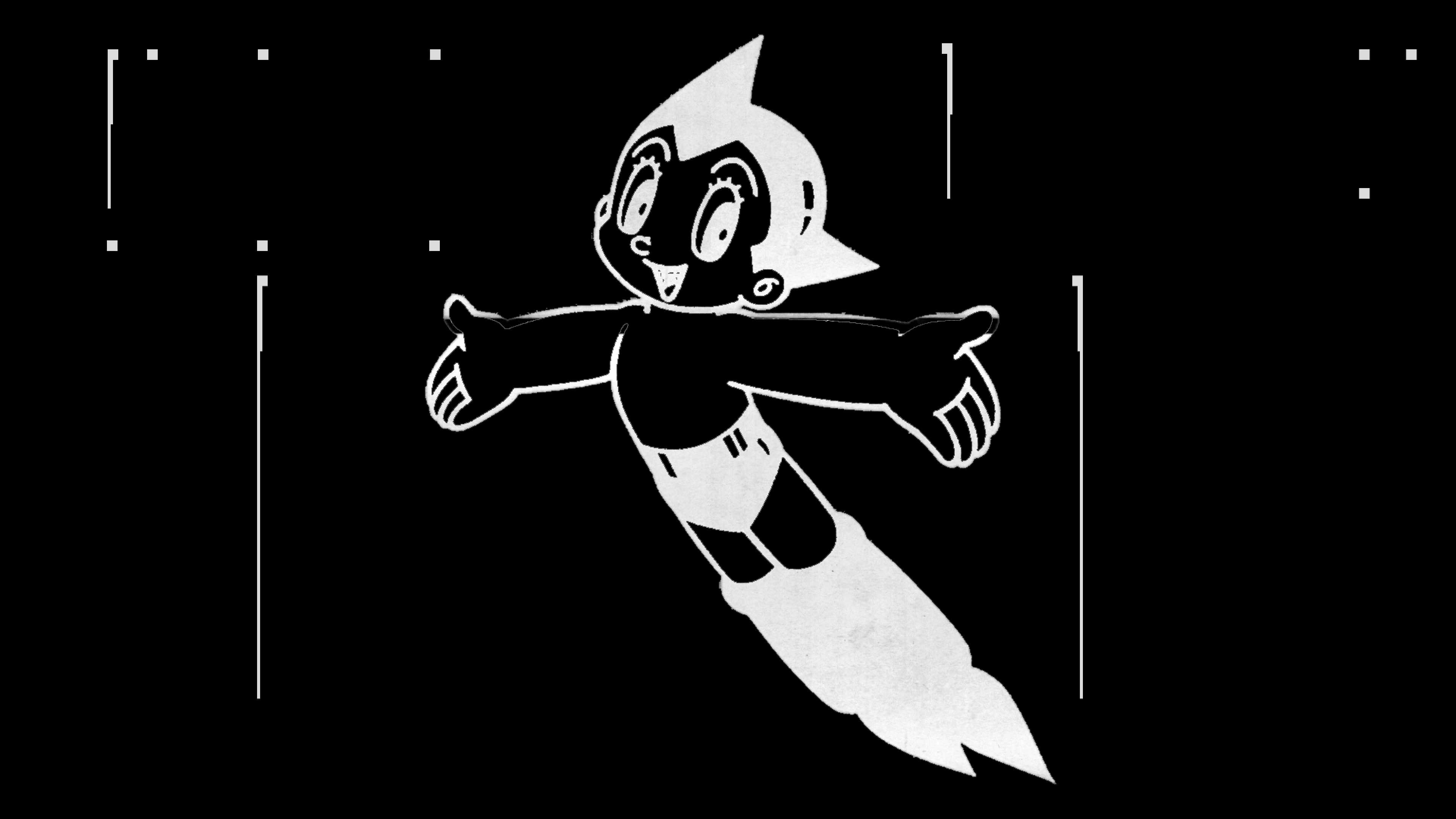
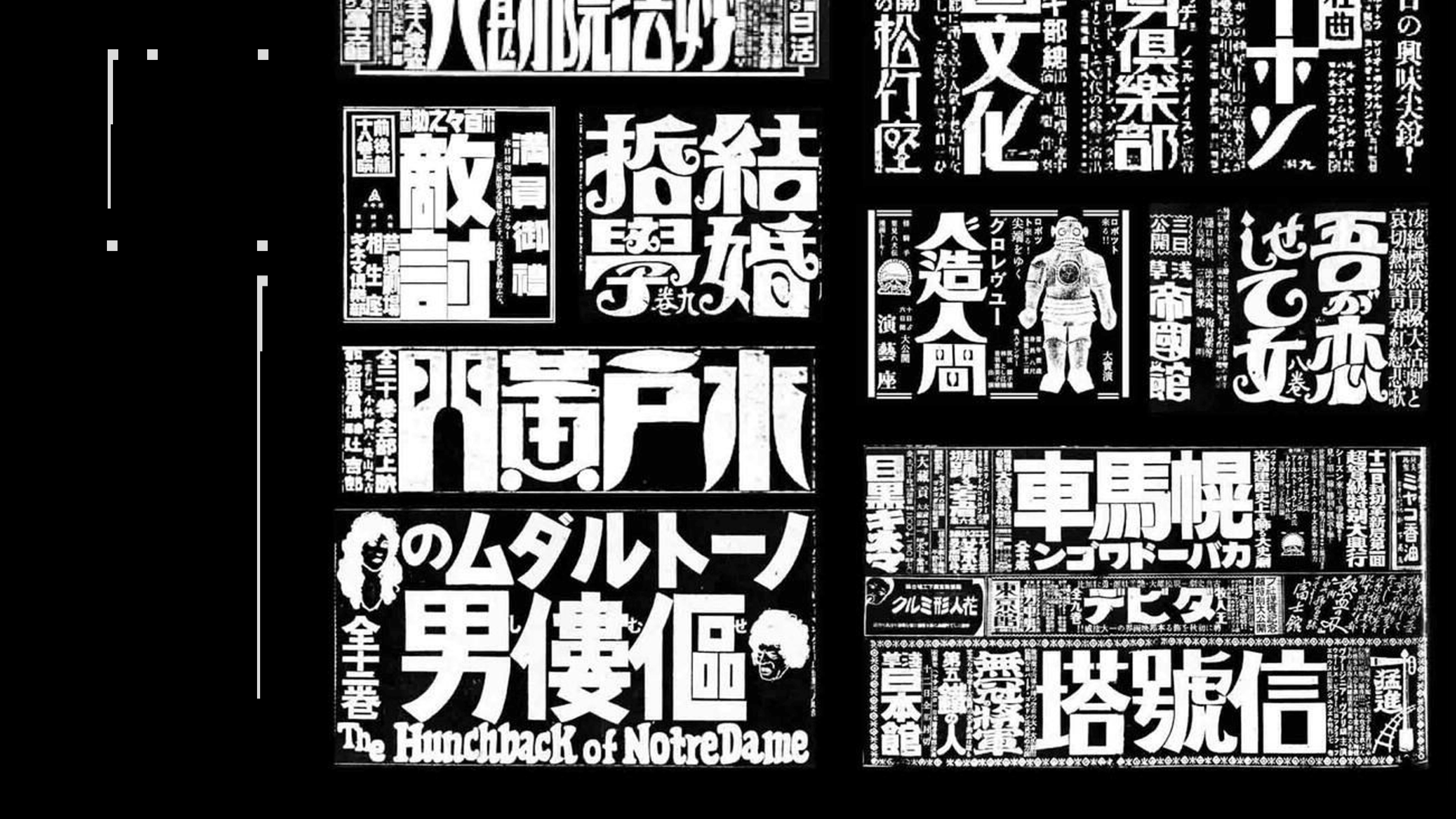
Another reference was reappropriation. Taking existing visual language, typography, images, layouts, and placing them somewhere else. The meaning slightly shifts. Becomes ambiguous.
Through these experiments NOT stopped behaving like a label. Sometimes it appears clearly, sometimes it dissolves into texture, noise, composition. More like an artefact than a word.
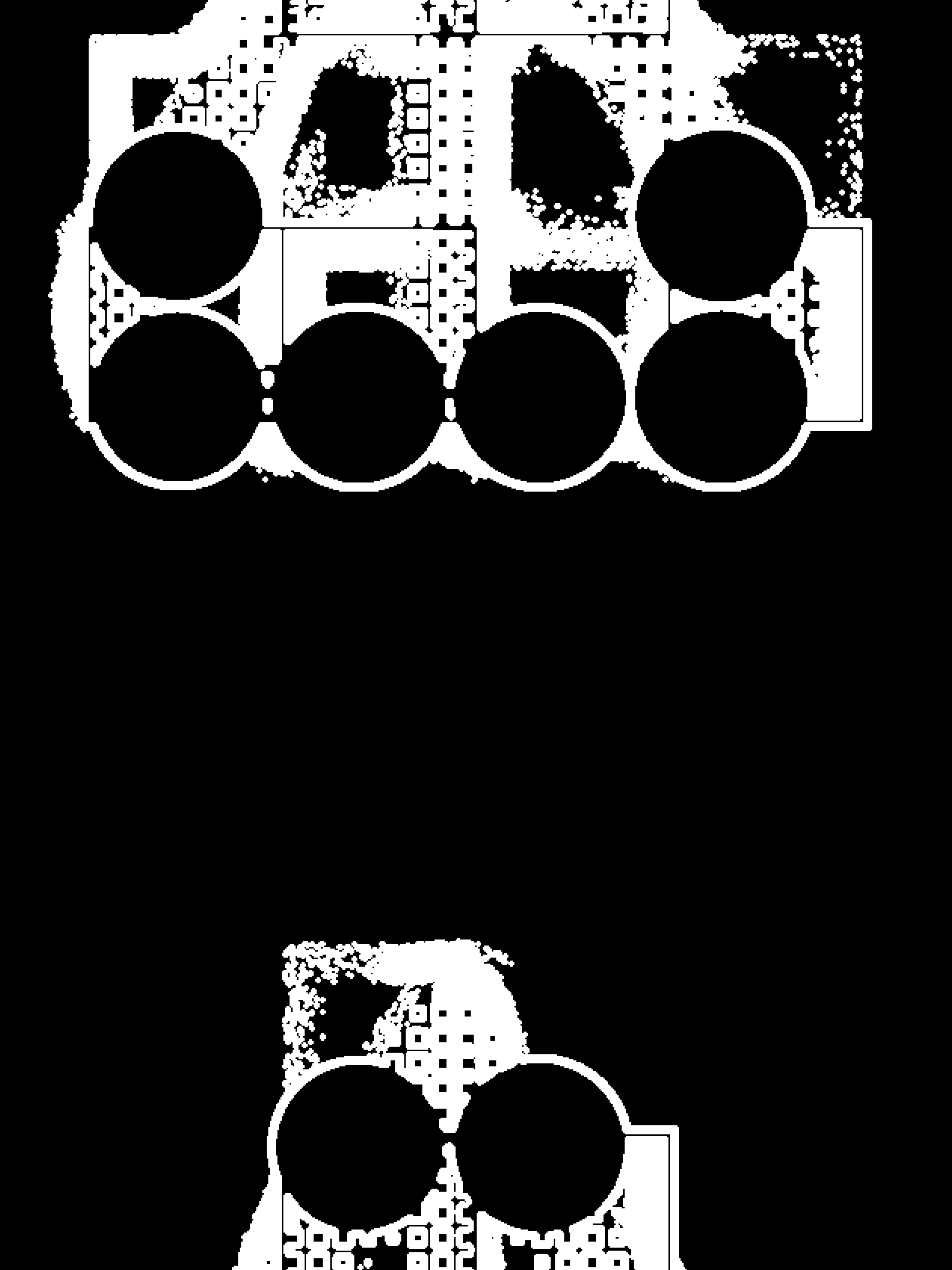
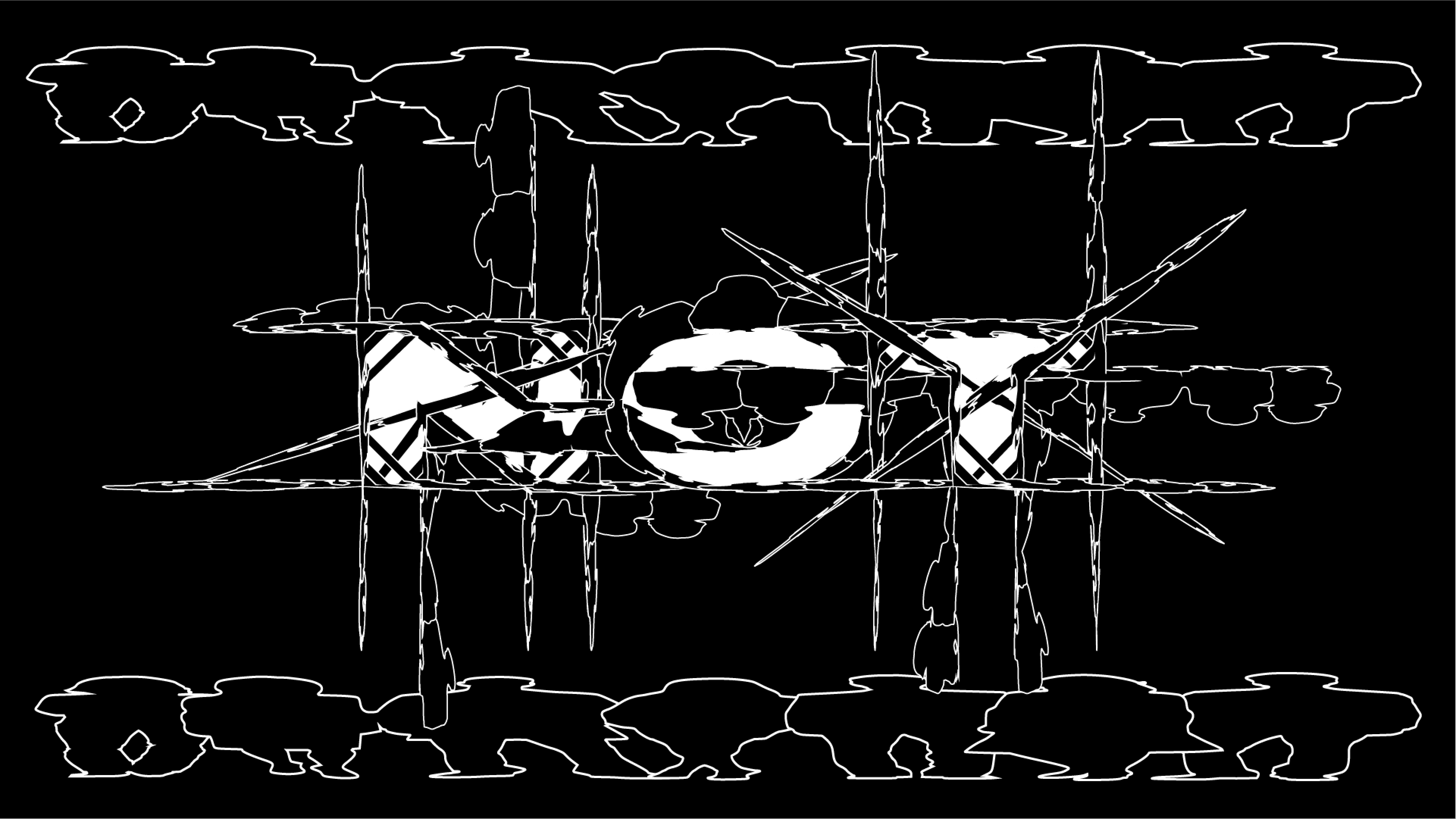
Symbol and form exploration
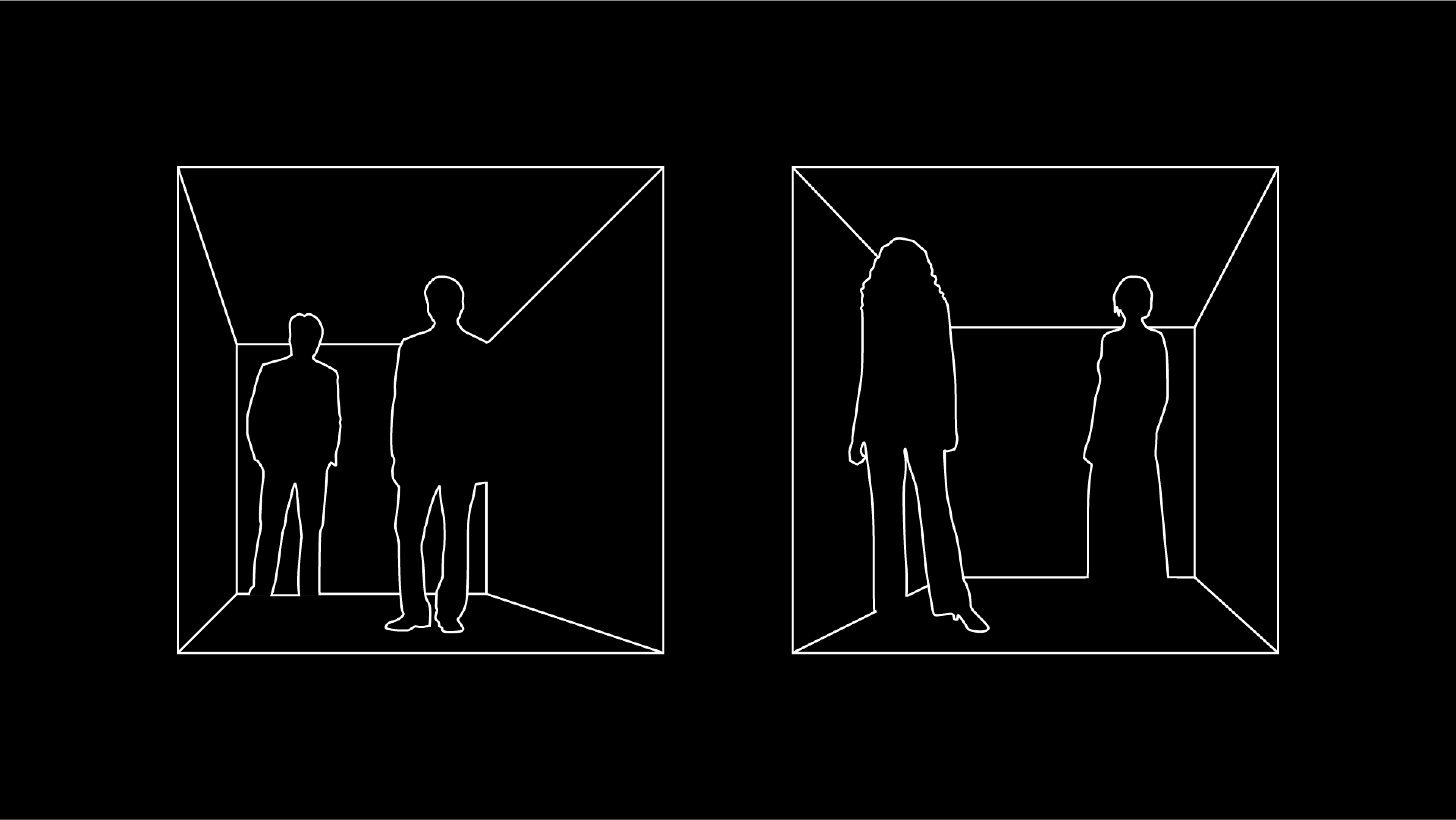
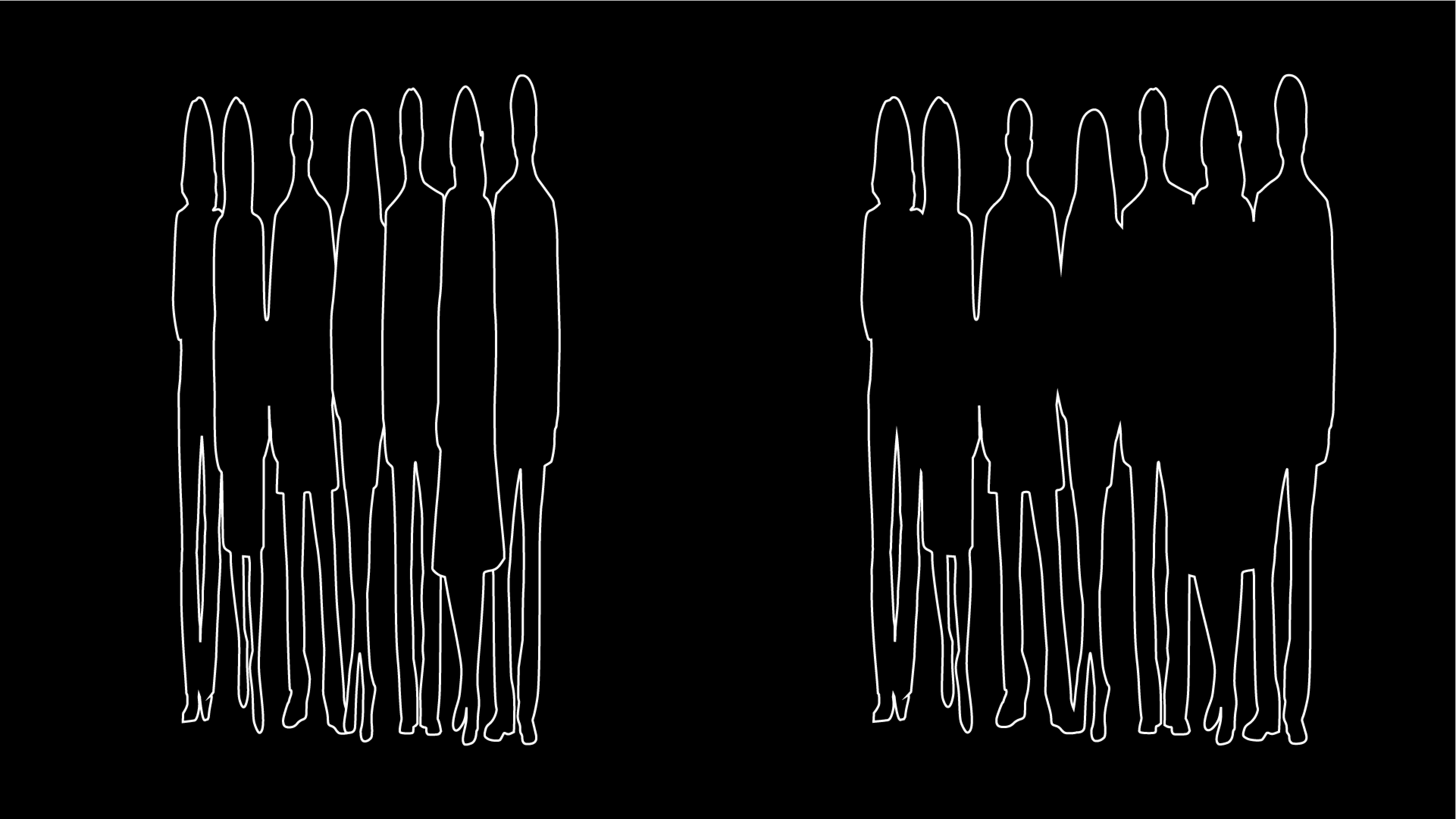
We started with basic shapes. Not to design a logo, to understand how form behaves.
What happens when you repeat a shape? Scale it? Push it to the edge of a composition?
Structure, rhythm, tension. The same element reading differently depending on where it sits.
Visual elements
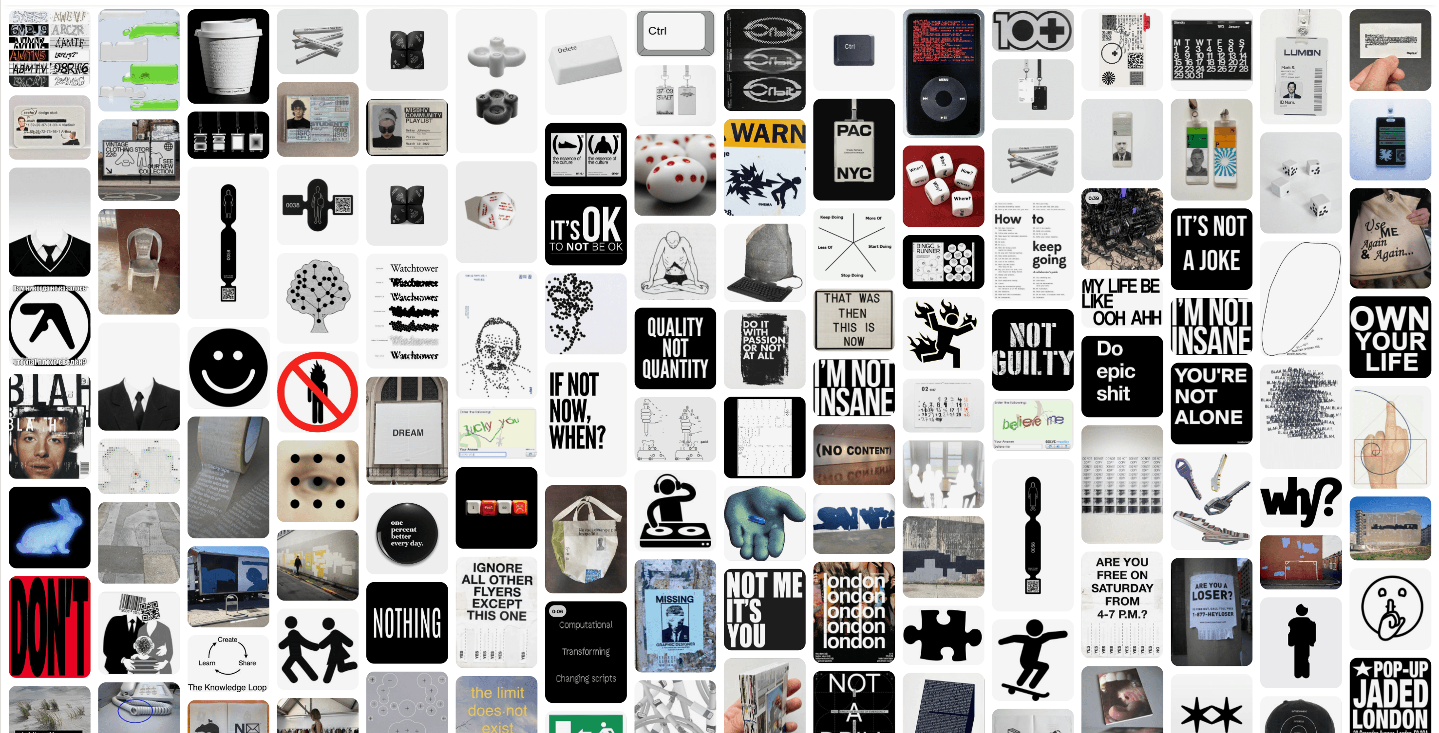
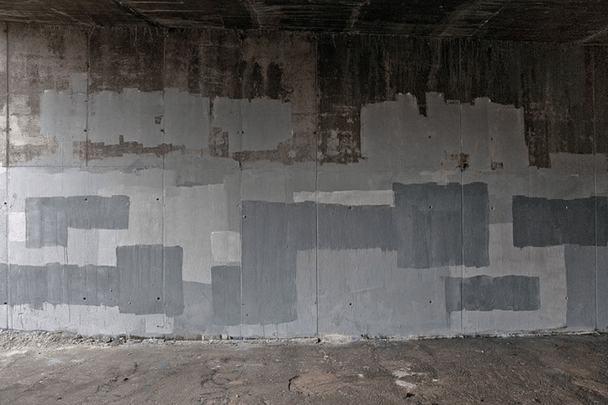
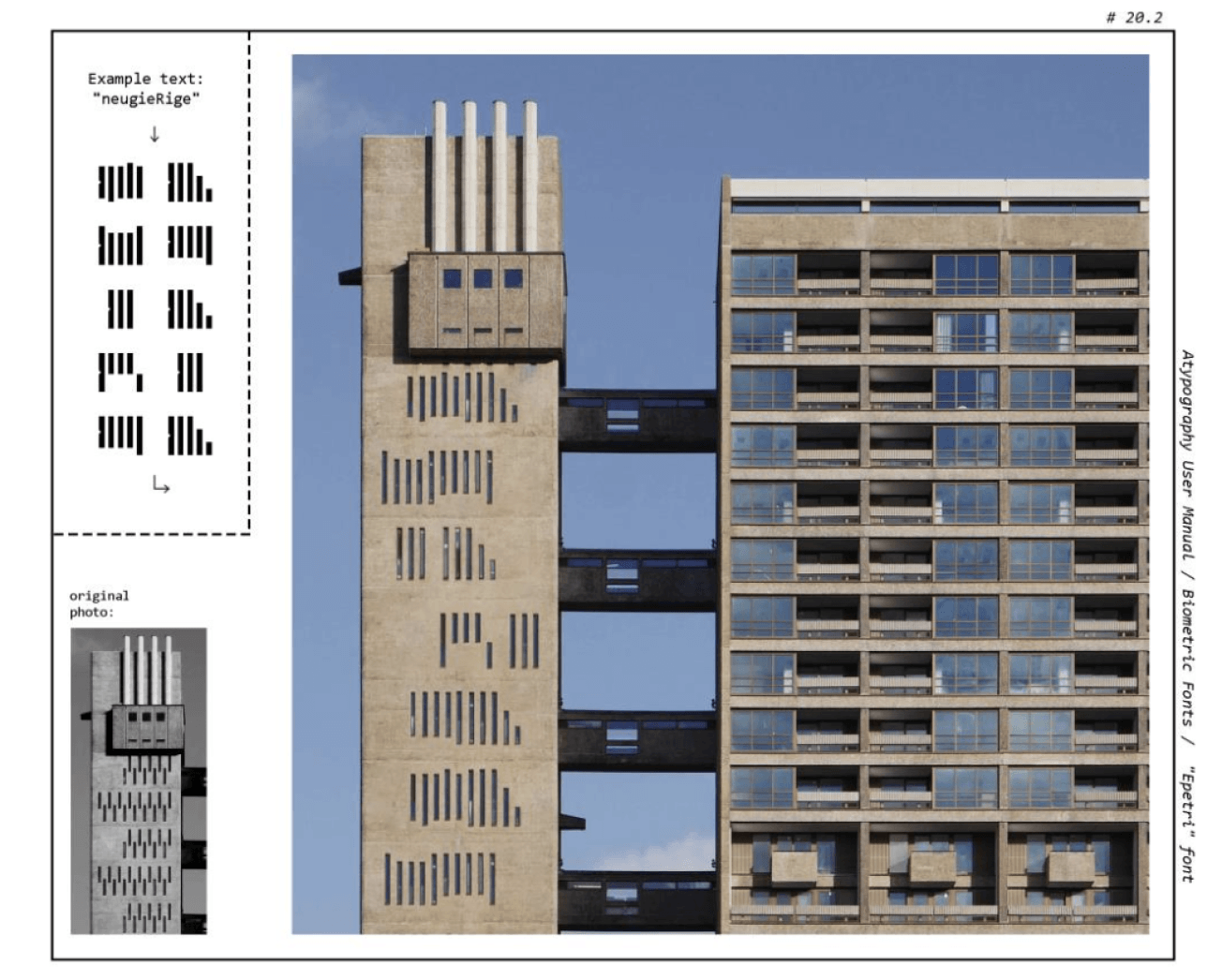
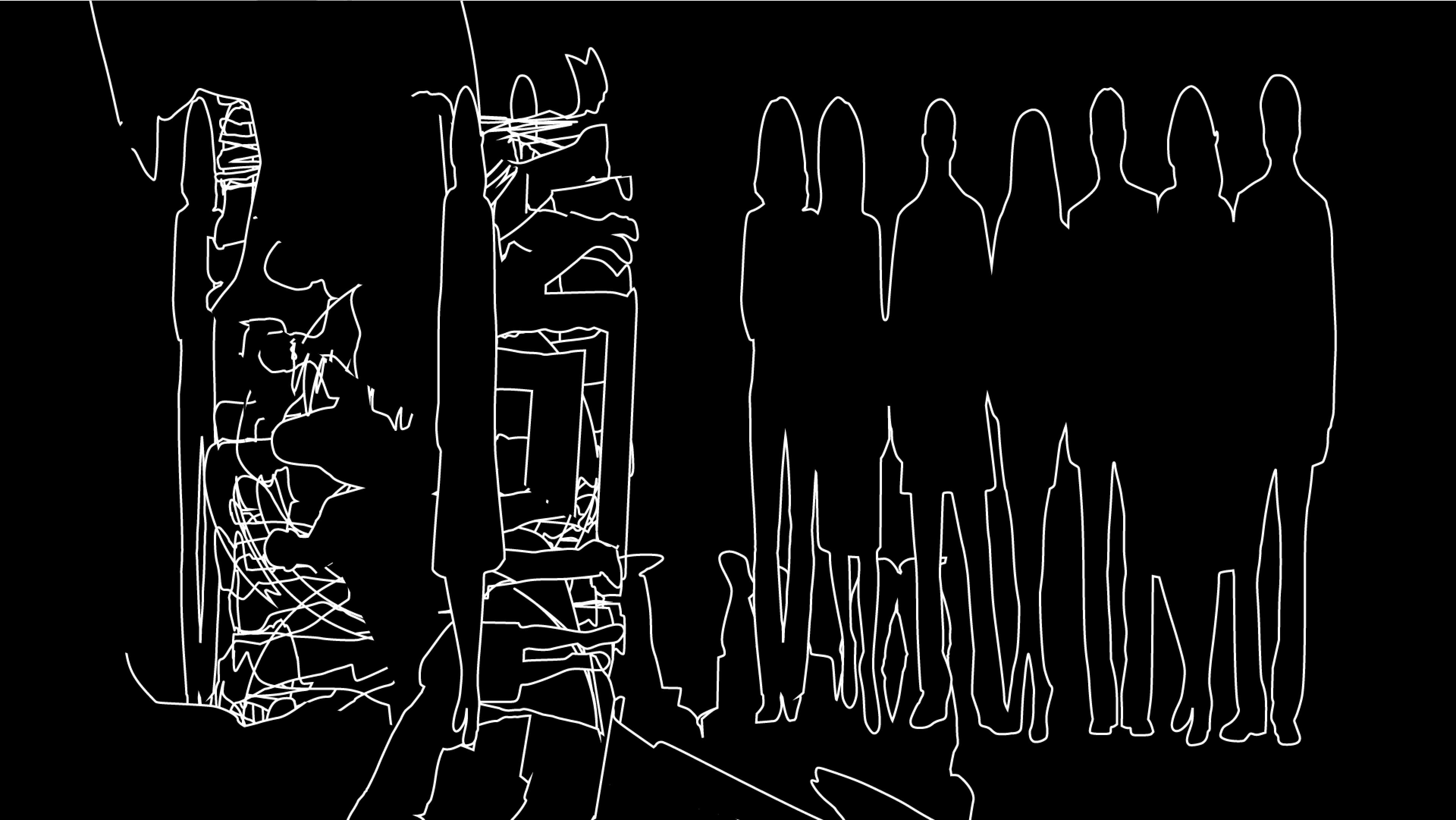
Then we started looking at the basic components that kept appearing across different compositions.
Lines, blocks, framing shapes, spatial divisions. Not really a system. More like a small vocabulary that kept showing up.
By repeating and combining them, they started to create rhythm and structure. A bit of their own logic.
The same components, different contexts. Posts, editorial layouts, interviews. They adapt without losing something recognisable.
Over time they stopped feeling like decoration and started acting more like building blocks of the language.
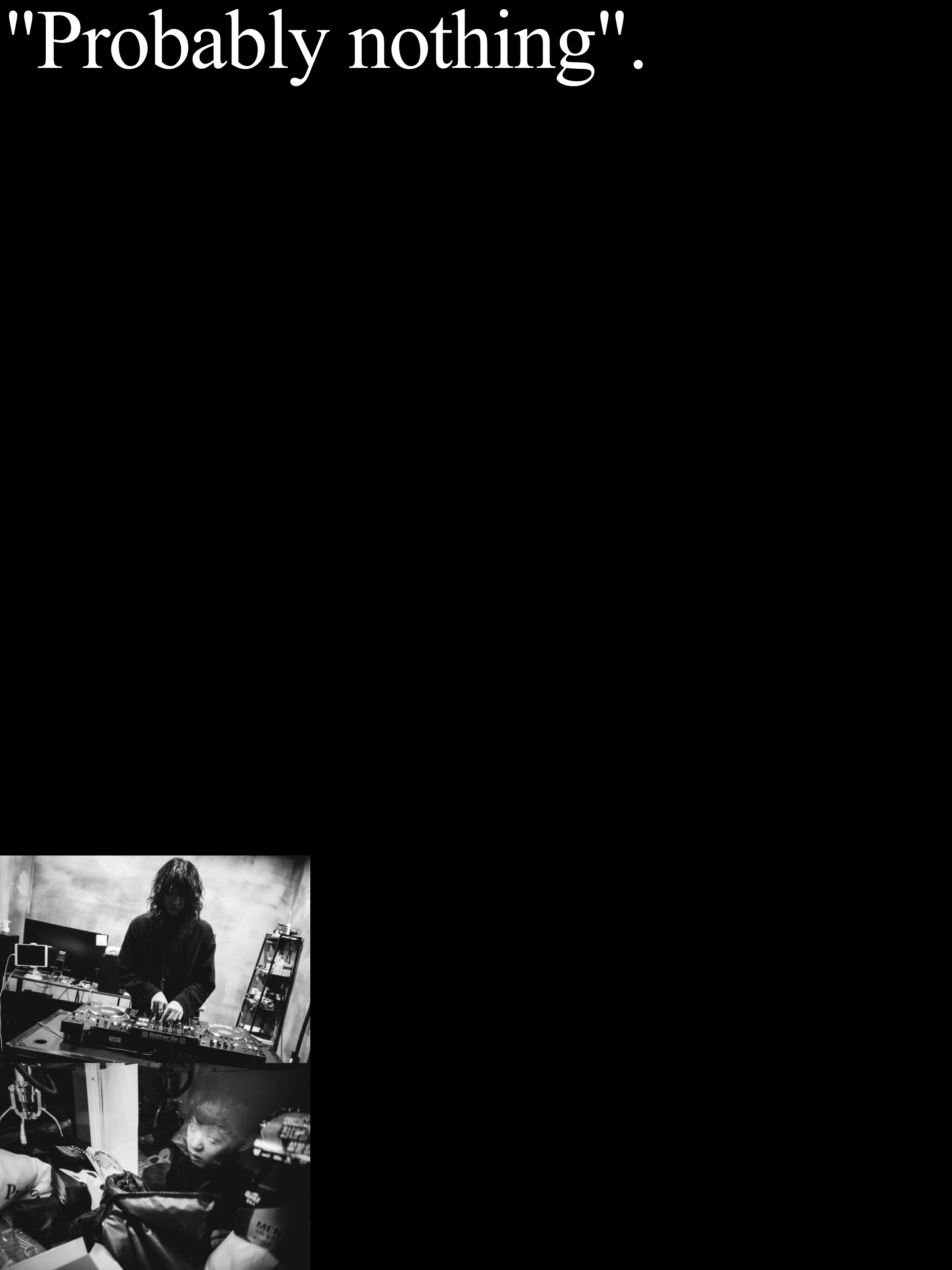
Cultural layer
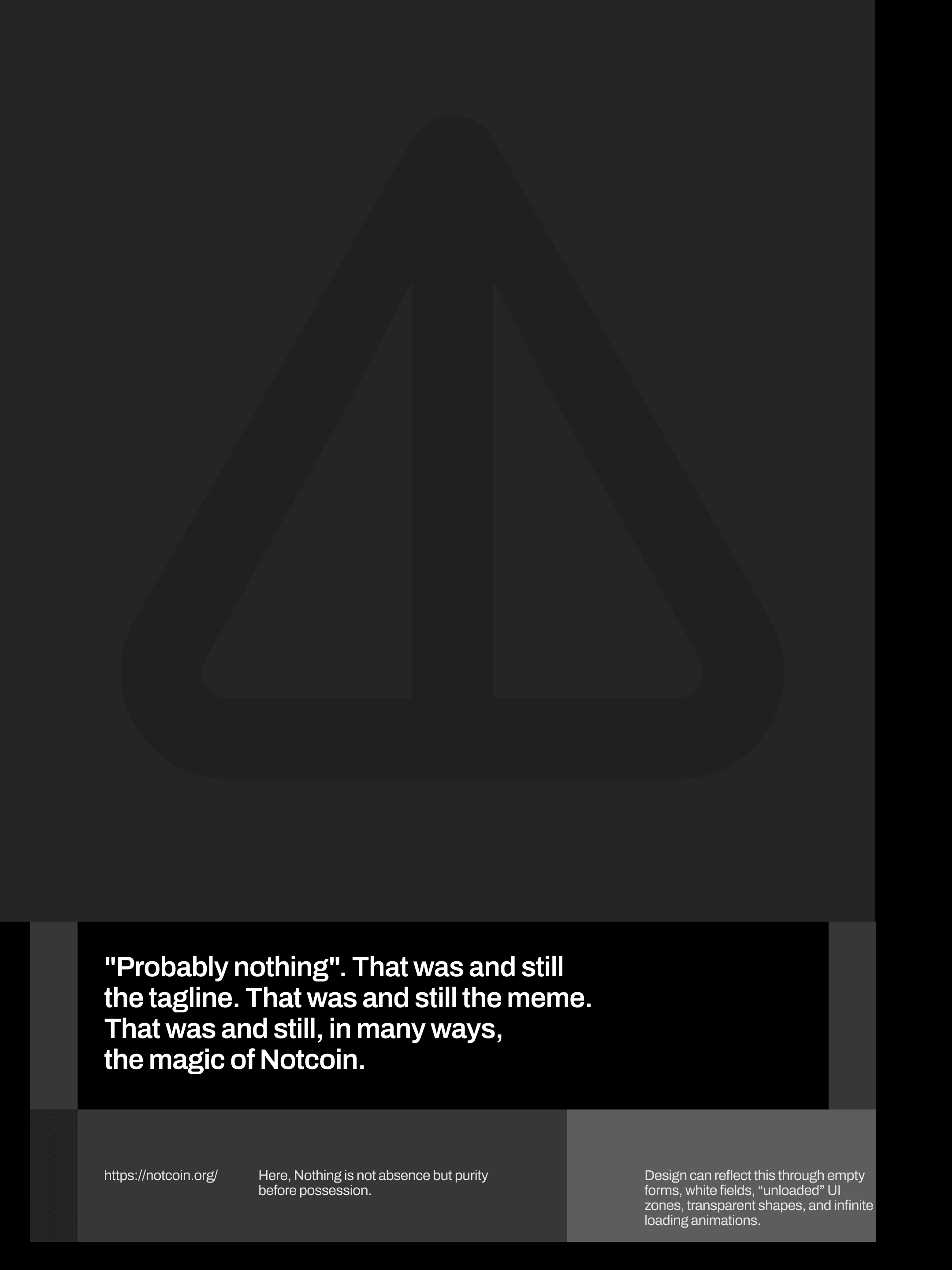
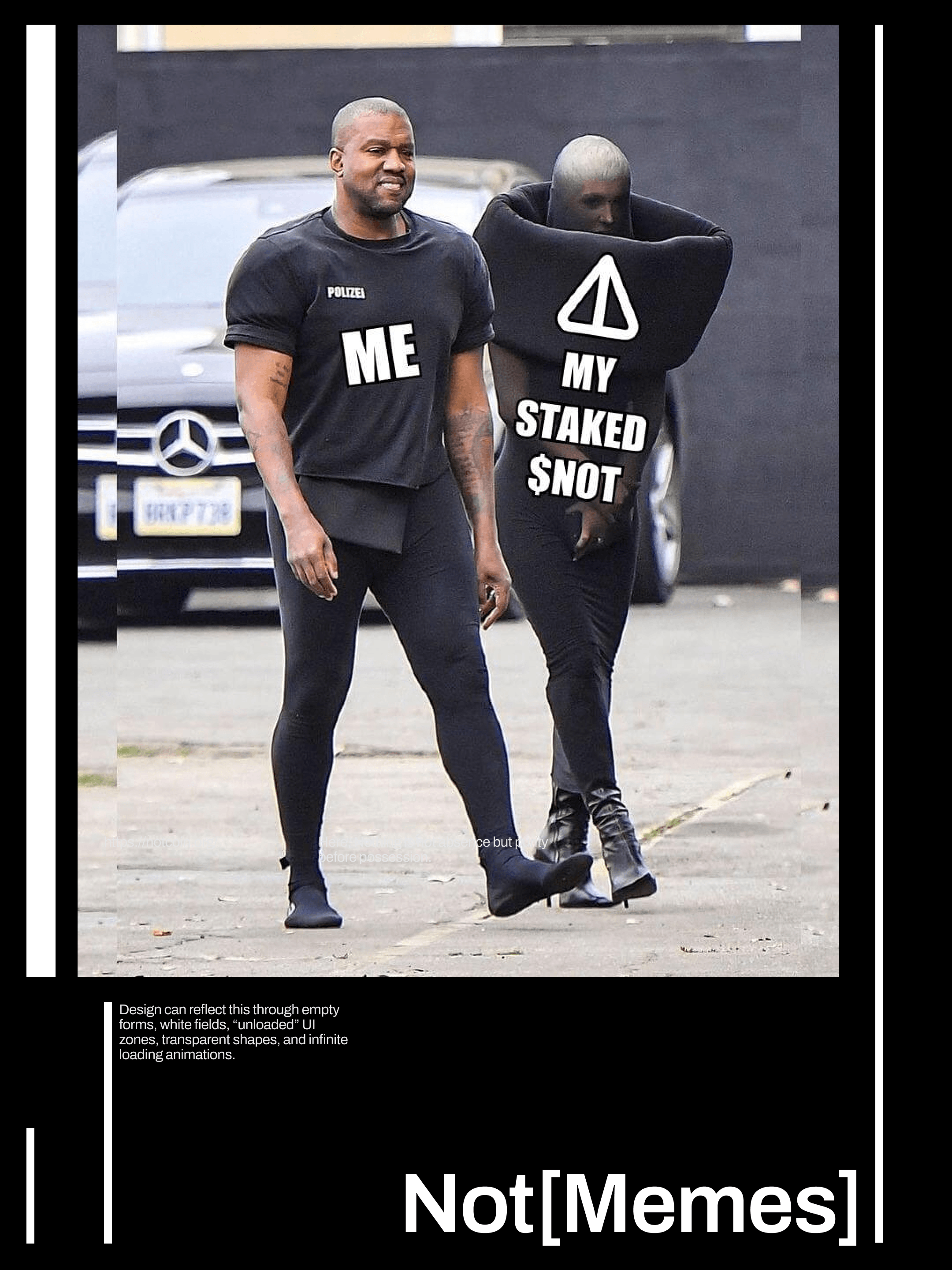
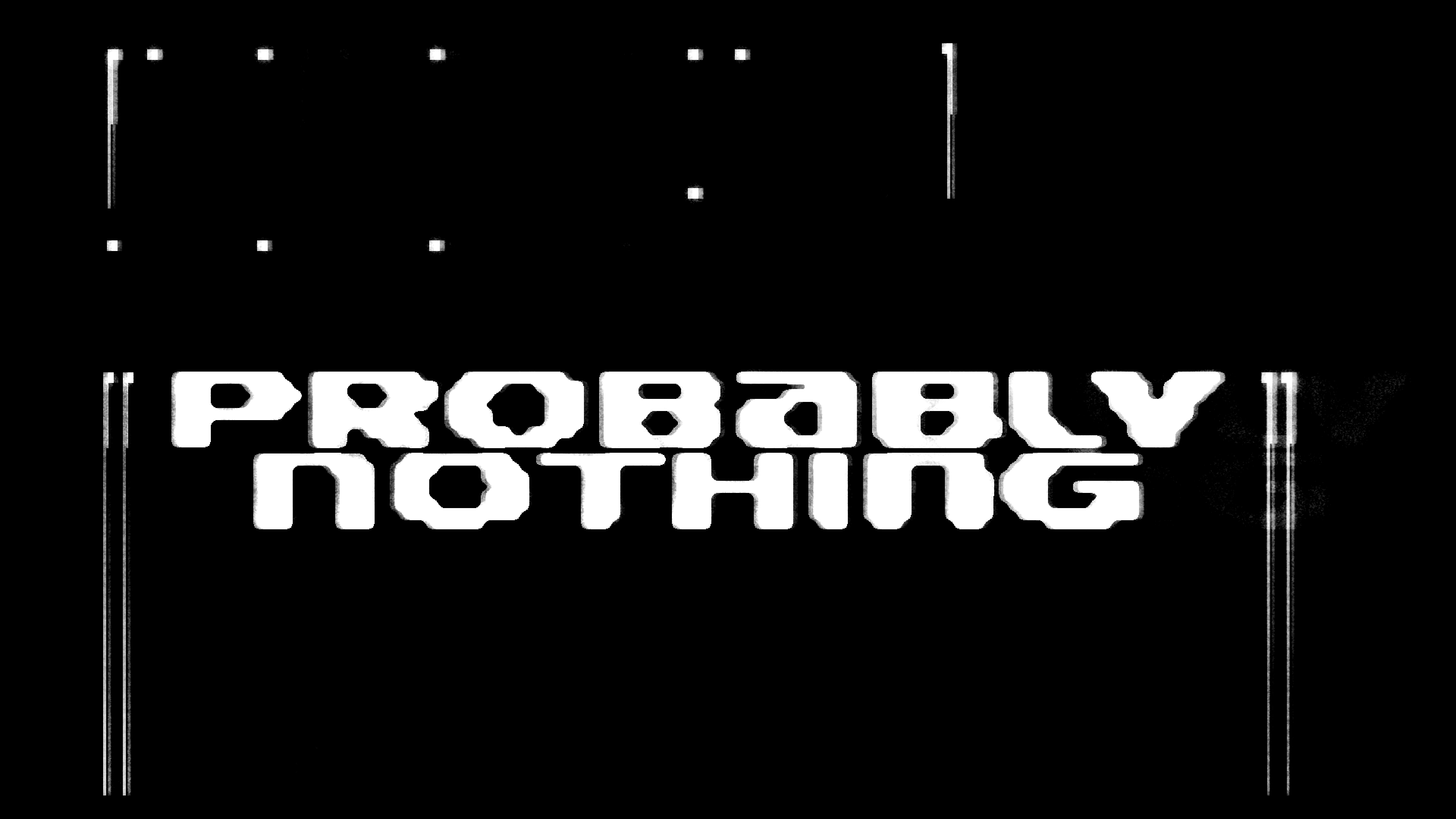
"Probably nothing" is a phrase that runs through internet culture and Web3. Ironic, slightly detached, open to interpretation. It kept appearing as a reference.
That tone felt right. Not a brand with rules. More like a cultural layer.
Postmodern design practices pointed in the same direction. Especially in typography and editorial graphics, where text is often fragmented, reinterpreted, placed in unexpected contexts.
The project does not try to control meaning too tightly. Visual elements can appear in different forms. Posts, editorial layouts, memes, conversations online.
Looking at the project this way helped keep the visual direction open. Adaptable.
Media formats
The visual language needed somewhere to live.
Interviews, social posts, editorial layouts, memes. Each format pushed the elements differently. Some things held, some shifted.
That instability turned out to be part of the language.
This research explored possible directions for the visual language of the NOT. It looked at how “nothing” could take visual form, how typography can function as both language and image, and how simple elements can build a composition.
The outcome is not a finished system it is closer to a framework or just a reference. Something open enough to grow, while still keeping a recognisable direction.
What it means is yours to decide.
tools: figma, arena, archives
participants: Timur, Sattel, Alien